OT: Gronk Logo v. Jumpman
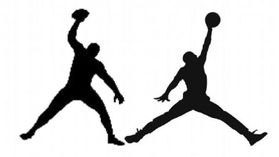
"Earlier this month, the shoe and apparel giant filed a formal opposition to the U.S. Patent and Trademark Office's Trial and Appeal Board, saying a logo of New England Patriots tight end Rob Gronkowski in silhouette spiking a football could be confused with its Air Jordan Jumpman logo that it has used since November 1987," according to ESPN.
The legal question is whether the use of Gronk's logo is "likely to cause confusion, deception, or mistake about the source of the goods and/or services" with the jumpman.
People on this Board have opinions. You be the judge and jury. What do you think?
Link to application (TTAB)
Never understood these comments. Not that it REALLY bothers me(it kinda does), and now I'm wasting more space on this board. Don't take this as an attack on you wolverheel, I actually appreciate the comments of yours I see. Just wanted to bring up the idea that we should, as a community, try to only comment when we are helping further the conversation. These comment threads get so long and bogged down as is.
NOW GET OFF MY LAWN.
Anyways, I think it is definitely easily confusable for the Jump man logo, especially on small items such as shoes and on TV where things are blurred during movement. I prefer the Gronk version of it though, so it's sad it probably won't last.
here is them next to each other for those interested: 

Funny jokes, memes, gifs are all welcome additions that help further the conversation(or not, but are still worth it). So don't think I'm saying every comment has to be about the subject and I have to deem it relevant. Its the "I don't care", type of comments that I'm referring to.
So a silhouette of a man with a round object in his hand can be copyrighted?
I say no.
Google "word art man silhouette with ball" and look at images
thousands
Just to make a small point, in this case it is a trademark (not a copyright).
I often tell my clients when they're contemplating the filing of a trademark application in the US on a graphic design to also file a copyright application. It costs only an additional $35 and gives the client additional bases to claim against an infringer. Likelihood of confusion can be a challenging standard to sell, copying gives additional grounds that may be more easily satisfied depending on the case. So bounce this idea off your IP attorney if considering trademark registration of a logo. 0.02
In response to this
ED: and so did someone below haha. My bad
I could go either way. Definitely similar
Anyone with a sports pulse knows what the jumpman looks like, and anyone designing an apparel logo would absolutely have been aware of the possible infringement. They brought this on themselves. The jumpman is iconic and they are definitely ripping off of it.
Problem I have always had with Nike logo is that the head is angled too high.
By time his legs are split, he is nearly rim level and should be looking nearly straight ahead.
In the logo, the angle his head is tilted indicates he is doing the splits on the floor or is at rim level looking at the shot clock.
- Quincy ME
exhibit A
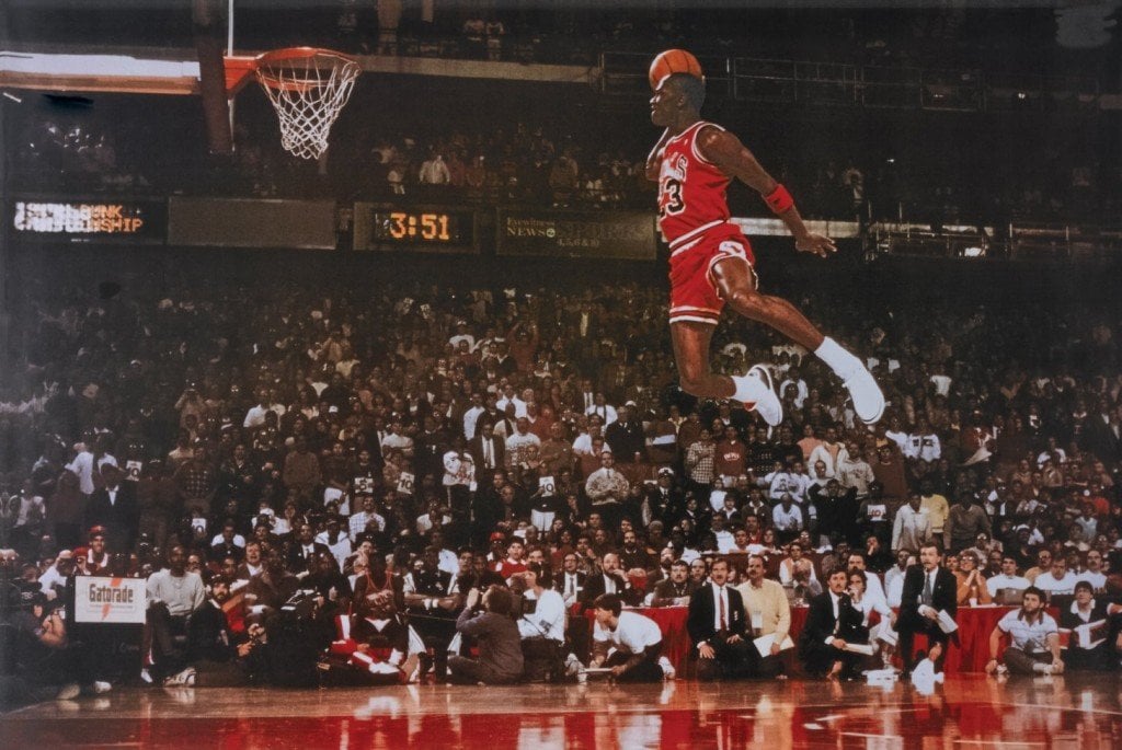
exhibit B

I think Exhibit B is counterintuitive to your point. He appears to be looking up, as he's on his way down.
By the way, both plays resulted in a Pistons foul.
I've never seen this Jordan photo that was used to create that logo. In the photo he is dunking with his left hand. Interestingly, the jumpman logo looks like he is dunking with his right hand. At least that is how I see it. It's like a roarshach test.
capris.
Don't really have an opinion either way, but I'd like to party with Gronk. What a braj.
They are similar.
'member this Jourdan jumpman?

& they were the best seats I ever had, happened right in front of me, so I will never forget. I think Harbaugh was initially slightly miffed that he gave up field position by catching it.
I'd probably give the points and take Nike's Banner & Witcoff of Chicago over Gronk's Bradley Arant of Birmingham anyway. Banner is a blue-blood of IP law.
Routinely prevail over their better-known peers. I wouldn't be so fat if this was not true.
Think of where these logos are typically worn -- on clothing, and the logo is just a few inches high. Could you readily tell, unless you got real close to the person wearing the shirt, shorts, whatever, the difference between these logos? I couldn't.
The Gronk team needs to make a logo where the legs are much closer together -- that would solve the problem. A silohouette of something like this.

I don't. I don't have time to go through every sports site. I swing by here and edsbs for Michigan and college football stuff when I can. I appreciate random, interesting articles posted to check out.
Sent from MGoBlog HD for iPhone & iPad