OT: Favorite Uniform ... of Another School

The last thread was about which UM color combo you liked best. This thread: which other team's uniform do you like the most?
This stupid site put the Oregon Ducks first, but we all know UM is #1 when it comes to the overall uniform. So, who is #2?
I almost want to say the Fighting Irish in home blue with gold helmets, but to hell with Notre Dame. What do you say?
March 16th, 2023 at 11:16 AM ^
UNC hands down, especially basketball.
March 16th, 2023 at 11:40 AM ^
Agreed. Great colors. One catch: I don't see the point of the argyle patterns and would subtract them from the uniforms.
March 16th, 2023 at 12:46 PM ^
Everyone will always have a different opinion regarding artistic impression, but I feel the North Carolina argyle design is as iconic as it comes in college basketball. Removing it after 30 years would feel wrong.
As wrong as giving credit for fake classes?
March 16th, 2023 at 11:17 AM ^
An OSU QB's jersey that has green and brown smears from getting sacked a lot.
March 16th, 2023 at 11:21 AM ^
And black from field turf.
March 16th, 2023 at 11:28 AM ^
With snot all over it from cold and flu sneezing.
March 16th, 2023 at 12:06 PM ^
And, some snowflakes….
March 16th, 2023 at 12:51 PM ^
And maybe some brown stains after they use the cooler.
March 16th, 2023 at 11:17 AM ^
I would go with USC (ytusc). Iconic and bold.
I too have a soft spot for USC's uniforms.
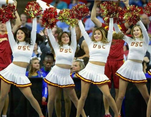
Soft spot? In that case I'm guessing you meant wet spot as well.
I was thinking along the line of hard but I get the drift.
I guess they have not yet followed the Sports Illustrated trend.
March 16th, 2023 at 11:17 AM ^
Florida State home uniforms.
Best by Conference
UCLA Baby Blues
LSU
Texas
Florida State
SMU
Toledo
San Diego St.
Funny how it works over time. Years ago, I thought LSU uniforms were hideous, but now they have an appeal for me.
March 16th, 2023 at 11:19 AM ^
Texas all whites
March 16th, 2023 at 12:00 PM ^
This is the correct answer.
March 16th, 2023 at 12:13 PM ^
Was just about to add this
It's a nice clean look, but lots of teams do all whites, even the Sparties, who go it as an alternate every now and then. I can't get too excited about all whites.
I think its the way the burnt orange contrasts it. Of course tons of teams do all whites. Hell Michigan rocks it. But to me the Texas ones look.....different/better.
March 16th, 2023 at 11:20 AM ^
My fave is U Maryland Baltimore County.
Only because of this.
Who is a big sweetie?!
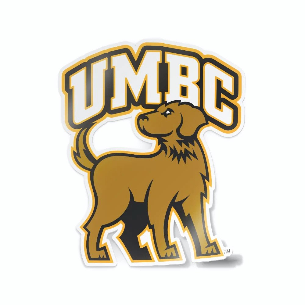
March 16th, 2023 at 12:34 PM ^
Even with the fake-aggressive-sneering-eyes, you just can't make a retriever look intimidating.
Especially when they are sleeping like the one curled up in a chair near me now. After lunch nap time.
That's exactly why I like the retriever mascot.
Best dogs ever.
Glad at least one school reps them.
March 16th, 2023 at 12:43 PM ^
And what they did to UVa in the tourney.
March 16th, 2023 at 11:22 AM ^
For me, I tend to like any team that has stuck, for the most part, with it's old-school traditional look. There's quite a few, but other than Michigan I'll throw in: 'Bama, PSU, Oklahoma, the Domers, USC, Nebraska, Texas, OSU (I guess), Iowa, UCLA. Probably others but that's the quick list off the top of my head.
March 16th, 2023 at 11:58 AM ^
Add Auburn to that list, especially their home uniforms
March 16th, 2023 at 11:24 AM ^
whichever one OSU wears when they lose
March 16th, 2023 at 11:24 AM ^
I dunno how it came to be (bc I grew up in a Fighting Irish household) but ever since I was a kid (five decades ago) I have always thought the big tiger paw on the side of the bright orange-red of Clemson is powerful and iconic.
Carolina Panthers are pretty sweat too. Also the Seattle Sounders’ home light blue & light green kit is sweet.
But the Kraken win this category.
March 16th, 2023 at 11:26 AM ^
I love the simplicity of the Penn State whites. I also really like the UCLA blue and gold combo.
Penn State especially Anthony Morelli's uni after meeting Alan Branch up close and personal.
I think the lack of names on their jerseys downgrades them. It goes back to Paterno wanting nobody to know anybody's name but his.
I like the PSU uniforms and simple helmets. The helmet remind me of my high school.
I would prefer to see the names of the players on the jerseys. It’s a fan convenience.
March 16th, 2023 at 11:30 AM ^
UCLA, Notre Dame, UNC, FSU, Texas, Penn State.
Yeah, I’m a power five traditionalist.
March 16th, 2023 at 11:30 AM ^
Some of Oregon's colors - like the deeper green - are kinda cool with the wings.
Its hard to argue with USC.
Texas is very unique with the burnt orange - nobody else has that.
i find it amusing that people love ND uniforms (not here, but overall) yet they're barely distinguishable from Navy's traditional or Pitt's uniforms when they play. So special.
March 16th, 2023 at 11:32 AM ^
At the risk of being VERY unpopular I really like the Ohio State road uniforms. I think the silver & white with red trim is sharp as hell.
Ducks.
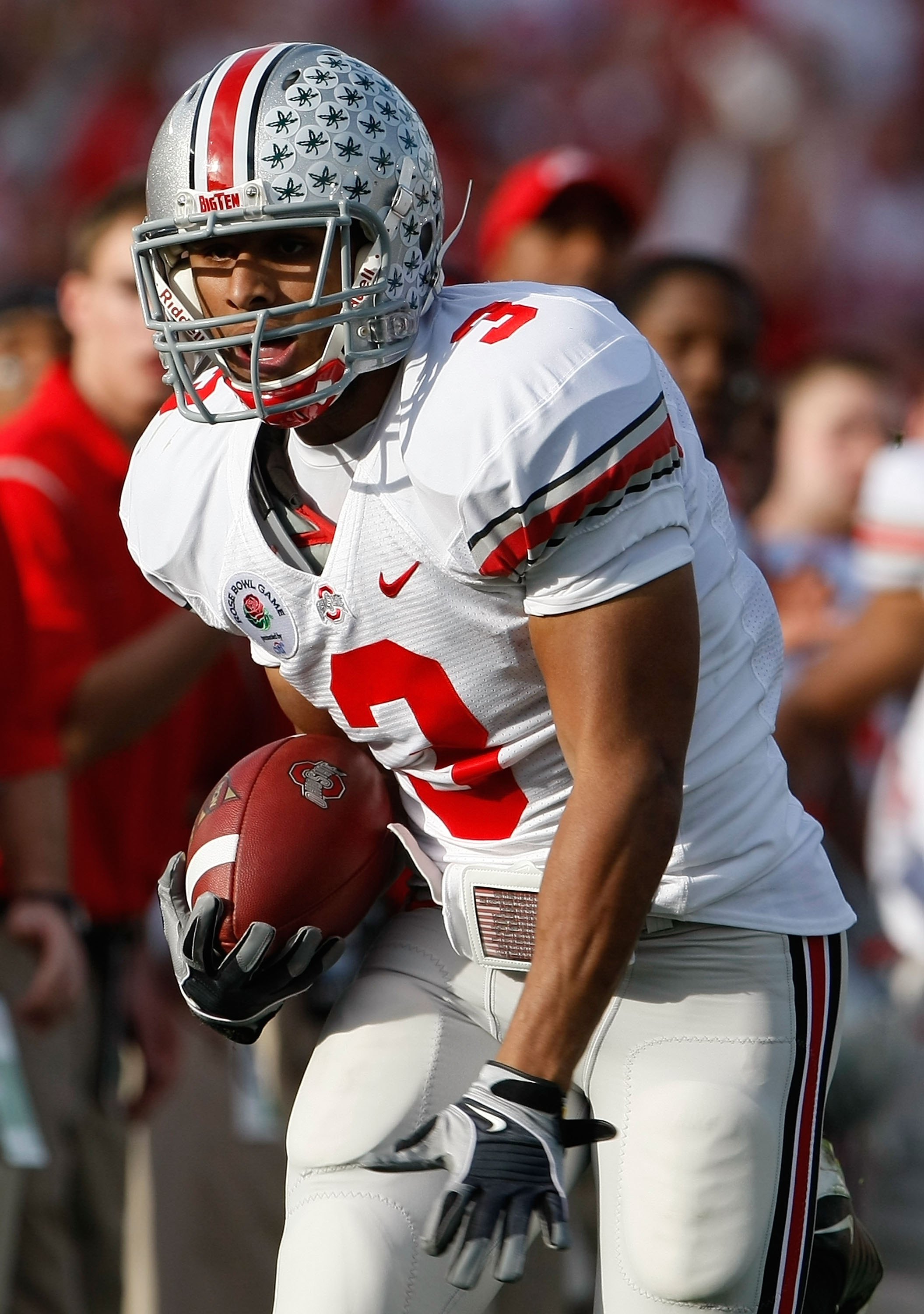
March 16th, 2023 at 11:42 AM ^
I agree with this. Gray goes with white better than ... maize (sorry) does.
Heretic.
March 16th, 2023 at 11:48 AM ^
Boo! Boo this man!
I did like watching them get hurdled two years ago though…
March 16th, 2023 at 12:18 PM ^
You’re right. They are aesthetically good. I hate them but I hate them because of who is in it.
One of the many great features of the rivalry is that the uniforms look good and look good on the same field together.
I've really thought that in recent years. One of the reasons it's the best rivalry is because the maize/blue clash with the scarlet/silver on a green backdrop. The game and colors look incredibly cool, especially at the Big House. (And you're right, those are probably their coolest, most classic and best-looking uniforms).
(I think uniform colors are actually an incredibly underrated aspect of rivalries: think of the best/biggest rivalries in sports and think how cool they look together on the field/court: Lakers-Celtics, Man Utd-Man City, Yankees-Red Sox at Fenway, etc. I'm a Knicks fan and thought they always looked cool going up against the Bulls and Heat.)
I would have to agree, and take it a step further, the contrast of OSU gear vs Michigan's when the play each other just makes for an aesthetically pleasing classic football game like none other.
March 16th, 2023 at 11:34 AM ^
USC Trogans, football.
March 16th, 2023 at 11:36 AM ^
I like the new jersey of the Portland's women's soccer team, the Thorns.
Entwining roses, thorns, and bad-ass text ("Rose City Till I Die"), combines an old-fashioned look and a tatted-up vibe.
It got complaints at first, including from the players, but they are now fond of the design.
https://www.nssmag.com/en/sports/32537/la-maglia-delle-portland-thorns-non-passa-certo-inosservata
March 16th, 2023 at 12:16 PM ^
I like this too! It really goes all-in on embracing the team's Portland identity (if we're being stereotypically frank, the thorn and rose motif is probably tattooed on the arms of at least several people at any given PDX coffee house)
The one thing that hurts it, which is common for soccer kits in general, is how prominently the sponsor name is displayed. I realize that this is literally what funds the uniforms and the team in general, but aesthetically they're always so distracting that you can't unsee them over the uniform itself.
Don't forget to name your favorite craft beer and bourbon to truly express how unique you and the other 50 million people just like you are.
Yeah, the "Providence" (which I assume is a hospital or health care system?) ruins it for me. Otherwise, a clever uniform, and I don't typically like busy designs.
It's why I don't think any non-national team soccer uniforms can truly be great -- the (increasingly prominent) sponsor name ruins the flow and/or meaning. NBA is essentially in this camp now as well, and I'm sure other leagues close behind.
LOL this thing looks like what would happen if Ed Hardy and Affliction had a soccer jersey baby.