This Week's Obsession: The Right Aways?


Spoiler: nobody answers "the bumblee ones" (and lives)
The Question:
With all the uniform-related news going around this week, I thought I'd ask about Michigan football's road jerseys, the not-so-constant in what's otherwise been a remarkably consistent wardrobe. Which of Michigan's road uniforms would you prefer they wear? Would you make any tweaks to a past look? Alternates—looking at you, Sugar Bowl uniforms—are very much eligible.
--------------------------------------
The Responses:
 |
| Not sure of original source; Adam found it on the board. |
Adam Schnepp: Ah, yes, Michigan's ever-changing road uniform. The wearable lab where the apparel supplier can tweak and tinker and see what whets the appetite of the jersey-buying masses.
My ideal road uniform is one that Michigan's essentially already wearing in practice (at right). I love the look of the all-navy numbers, but I'd add the blue-maize-blue shoulder striping Michigan wore from the mid-70s to the 90s.
I know Ace mentioned alternates as candidates for primary road jerseys, but in a world where multiple night games are likely it's hard to think alternates go away so I'll pick one of those while I'm at it. If Michigan wants to wear a "legacy" jersey on the road let's make it:
1) something they actually, you know, wore
2) something that integrates the wolverbear:

[Via the MVictors Uniform Timeline]
Go back to 1962 and there it is: block M on the sleeves, wolverbear on a patch, otherwise clean design. A legacy jersey I might actually buy despite knowing that I usually look like a doofus in jerseys.
[after the JUMP: we take piping very seriously]
--------------------------------------
 |
| The Adam Plan. |
Second choice would be another vote for the Schnepp Plan, sans Wolverbear. When I saw those in practice I thought they looked way more Michigan than anything we've worn since.I wouldn't even use shoulder stripes. Without all the stripes to offset, your eye is drawn to the blue numbers and the yellow pants. Going classic is usually going boring, but Michigan is certainly among the few schools that could pull off a statement like "we're the yellow and blue team...of sports." Anyway the helmets have enough going on for the rest to be an understatement.
Yellow, by the way, should be that goldenish color of American corn (there's a name for this) that's been faded by the sun.
My last request—and this goes for all the jerseys—is the numbers should be way larger. This was an Ohio State thing that Bo brought to Michigan in 1969: make the numbers extra large, like as huge as the shirts can take. Kinda puts an extra scare in the minds of teams coming to play the old power program.
--------------------------------------
Dave Nasternak: Probably my favorite Michigan road uniform is from the 2000 Orange Bowl (still would LOVE to own a white #10 with an Orange Bowl patch). The blue numbers outlines in maize and both colors trimming the edges with Block Ms on the sleeves...really liked those.

Nike also did some experimenting over the next few years with adding a maize stripe down the side and worked in some maize piping. All of those were fine, for the most part. They were generally pretty clean and the differences were rather minimal. I get that marketing will want to make slight adjustments to sell "this year's" jersey. That's fine, I guess. Like most other MGoContributors, though, I wasn't a huge fan of most of the alternate jerseys over the past few seasons.
I suppose if I had to choose one, perhaps the Alabama 2012 uniforms? I wouldn't want these to be the primary road uniforms, but I would probably be fine with them being worn once every couple/few years.

As far as the Legends Jerseys go, I'm with Brian in that I liked the idea as a whole. I think the implementation could be a little better (more infrequent use, maybe only Seniors? only 2-3 at a time?). Also, what about helmet numbers every so often? Maybe once out of 4 years?
--------------------------------------
Ace: I really liked the look of the Sugar Bowl uniforms, which are what I had in mind when I mentioned alternates:

Remove the helmet numbers and the patches, make the uniform numbers a bit wider—perhaps by getting rid of the maize trim—and I think those are pretty great: clean, sharp, and simple but not Penn State simple. I'm a big fan of those shoulder stripes.
Otherwise, I'm down with something along the lines of what Adam suggests. I liked the simplicity of the last Nike away jerseys before Michigan made the switch to Adidas, if only they'd done away with the pointless maize piping. While I have remarkably fond memories of the 1997-2000 era uniforms that Dave posted, I think they've got just a little bit too much going on—and, with today's short, tight sleeves, the block-M emblazoned, double-piped shoulders probably wouldn't look nearly as good as they did back then.
--------------------------------------
Brian: I'm with Ace on this one: when the Sugar Bowl uniforms (no Z!) were announced, my immediate thought was "I wouldn't mind it if those were the permanent road jerseys." It strikes a nice balance between busy and plain that I don't think any of the other options have.
The plain whites are really plain; the Brady whites have a tiny bit too much frippery. I'm not a huge fan of the multi-hued block M on a white background. (The Block M on the pants is perfect and should stand as the only one on the uniforms, IMO.) The white and maize next to each other are a bit confusing visually. The large blue stripes on the Sugar jerseys give them a tiny bit of a winged helmet effect and are large, clear design elements. Dump the patches and helmet numbers and it's a winner.
The plainer the uniforms are, the better.
Striping is superfluous on the home uniforms. I think that is the case with the aways as well. Unless you're talking about the bitchin' 70s all whites.
I find the 2011 away uniforms at Northwestern to be the best. Can't beat the Adidas logo being in the collar.

Now if only they would put the logo in the collar like Nike did with the home jerseys...
Sent from MGoBlog HD for iPhone & iPad
A big fat NO to the yellow apron strings, as someone called them on the forum.
March 25th, 2015 at 11:37 PM ^
I like those as well
i dont have Thujone skillz on paint but...

You, sir, are welcome to be on my lawn.
Why do football uniforms have shorter sleeves now than they used to? They look really weird.
March 25th, 2015 at 11:38 PM ^
is so they can't be grabbed by the opposing players
March 25th, 2015 at 11:42 PM ^
The longer sleeves just get in the way, and with uniforms getting tighter, having long, baggy sleeves wouldn't match the rest of the jersey. I believe most players like the tight, short sleeves better. And trust me, they are much nicer to wear. My high school team switched from loose jerseys to the new tight Adidas Techfit uniforms, which look almost identical to Louisville's save for the colors, and they are 1000x better.
Lose the blue collar, and that is definitely on the right track. I'd still lose the sleeve stripes, but I understand that they're a traditional element. I'm in the minimalist camp.
Sent from MGoBlog HD for iPhone & iPad
I went on wayback machine to the MDen from 2007 and found that Nike version of a Maize Michigan shirt. Tweeted it last night.
Maize is in the eye of the outfitter.

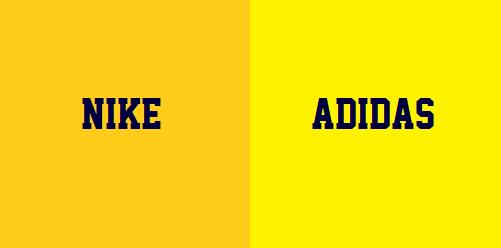
Nike "Maize" is #FFCB19

Adidas "Maize" is #FEF200

True Maize is #FBEC5D

EDIT: "True maize" if you go by Wikipedia
Michigan's true "maize" is #FFCB05, considerably closer to Nike's "maize"

why Michigan continues to allow Adidas to use w/e color they want to is mind boggling.
All I see is a blue & black dress
I think the Fab Five jerseys were closer to that bottom shade.
Yeah they deff were. I just re-watched 30 for 30 the other night.
March 25th, 2015 at 10:29 PM ^
Michigan also was not with Nike at that time. Russell Athletic made the uniforms.
Nike's first Michigan Basketball uniforms-

March 26th, 2015 at 12:41 AM ^
Whatever version you like, one thing for certain: Maize is way better than hazard-sign, screaming day-glow yellow.
That this is the genuine "maize" used back in the day of my grandpappy and his grandpappy before him?
March 26th, 2015 at 11:36 AM ^
Adidas "maize" is just yellow.
Probably in the minority here, but the Adidas maize has grown on me. Maybe it's because athletic fashion in general is moving more towards that loud and pronounced look, but I find the overwhelming brightness of it on TV pretty cool looking, especially for basketball.
Ouch!! Adidas hurts my eyes. I think that's a sign it's gotten too bright.
- The 1940's oldsters, I guess - opinion of "Maize" is, and if what we are using today is the color used back then. I remember seeing a throwback Tom Harmon Jersey - and who knows it it was authentic - that looked, I don't know, more golden.
and it is bright yellow.
I think maize is in the eye of whatever is available at the Asian point of manufacture that week.
Yes, perhaps yours is not as dark as other Nike maize due to the tears and sweat of the Asian sweatshop workers that day
Pictures on computers don't mean a ton to our eyes on gameday. The tweaks in "maize" have mostly been made to make the uniforms look better on TV as that tech has changed.
HOWEVA - make the "yellows" UNIFORM! It drives me nuts when the wings don't match the numbers don't match the pants. Pick one and stick to it.
The identical color will look different on different materials.
I dont doubt that and I know that sweat messes it up too. But c'mon man. It's called a uniform... the colors should match.
I briefly worked for the company that (at least at that time) made all of the ink for Coca Cola. There are no fewer than EIGHT Coca-Cola reds, because if you want red ink on an aluminum can to look like it's the same color as red ink on a cardboard box, you have to use different color red inks. Likewise, it's not at all trivial to get the maize in the jersey to match the maize on the helmet and have them both match the maize on the field.
That being said, there's still no excuse for not having them all match. It might not be trivial, but it's certainly doable. Though apparently we can't expect such sophistication from a supplier who can't even make a jersey durable enough to survive a B1G basketball game...
March 25th, 2015 at 10:06 PM ^
Or...just go color blind. Then you don't need to give a rat's ass on the different maizes (or golds or greens, depending on how the light is hitting them)! That whole color thing is a giant part of life that I don't have to worry about...and I'm always looking to cut back on what I have to worry about.
Interesting stuff about Nike Maize vs Adidas Maize. I prefer all things Nike Maize--not just cuz it's Nike but because Adidas Maize looks like a yellow highlighter. The biggest problem with Adidas Maize are the fan t-shirts, which just look horrible on TV and in person. (Sorry Maize Rage, it does.) Adidas maize looks a'ight on the uniformz on the teevee.
I actually think our current road uniforms look great. The practice uniform is too plain and the number font on the sugar bowl uniforms are weird looking, to me at least.
I think Devin looks awesome up there. Take away the patch and white with large thick Blue numbers and maize outline on front/back and sleeve looks good to me.
I'm probably being heretical here, becuse it is the adidas jersey that I think looks the best, but then again, I also like adidas version of Maize better too. Just a personal preference, but the bright yellow really pops against the dark blue. The true maize always looked orangy (its a word now) to me.
I wouldn't mind if the sleeve numbers got switched to the sugar bowl stripes. If they ever did a throwback white pants (not a preference of mine, but I know a lot would like it) having two similar large stripes on the side of the pants (straight stripes, none of this organic crap), would make the design work together and would save the pants from looking like long underwear.
I like them all, but prefer the maize piping around the numbers. I'd also like to see Michigan wear their blue uniforms against OSU every year. I don't know why both teams don't agree to that. It's awesome when USC and UCLA both wear their home uniforms. I get the fact that both teams play in Los Angeles, but it just looks neat when both teams have their home uniforms on.
This would also prevent both programs from using that game to do a unique design for that one game. Brings nice nestalgia to me.
March 25th, 2015 at 11:43 PM ^
That would be fantastic
like I am going to get hammered for this, and I probably am, but I would like white and blue pants to be part of the rotation. All blue was cool at home, and the occassional all white on the road(without bumblebee additions) would be pretty cool. Florida State did this for years, and they did not have to have "alternates" because they had various color schemes and just mixed it up. With the exception of maize(or any yellow variant) jerseys, I say expand the color scheme and let's have a little fun with it.
I agree. Here comes the real negbomb, but I didn't even mind the bumblebees for a one-time thing. It's just a uniform. This is like 'nam, there are no rules.
by any objective(or subjective) standard the bumblebees were close to the ugliest thing ever worn by a human being, in public or private. I was not sure who I was cheering for once I saw those that day.
It's a Sparty color. We should wear as little white as possible.
Blue pants on the road might not be too bad, but not at home. Monochrome doesn't look good.
road uniform would look neat! Blue numbers and horizontal stripes on upper sleeves.
Comments