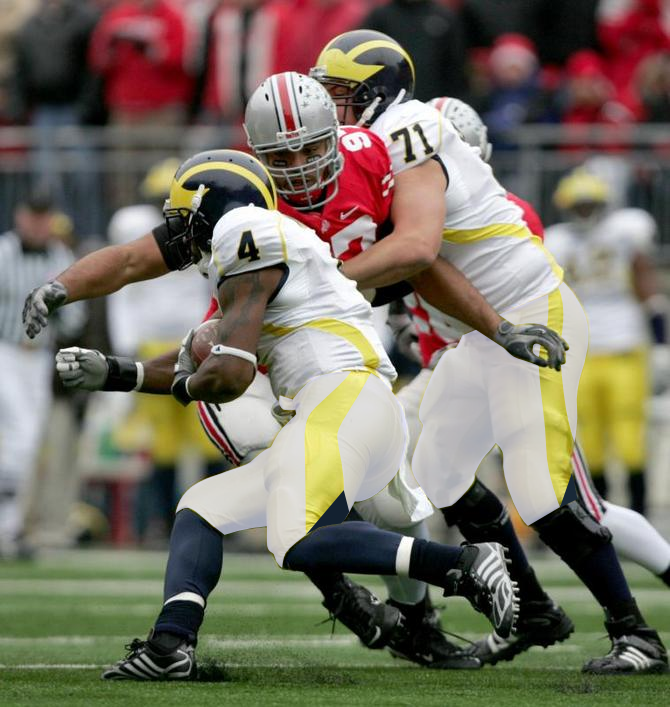
Road jerseys: to trim or not to trim?

So, if Michigan were to make a change to their road jerseys, would you be in favor of going back to the old look of solid Blue numbers like some players are sporting in practice?

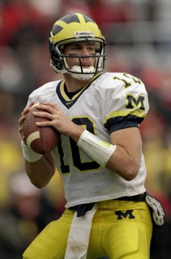
They sported this look of solid Blue numbers until Nike introduced the Maize trim to the numbers in 1997.
Personally, this is my favorite Michigan road jersey.


March 24th, 2015 at 10:59 AM ^
I think these are awesome.
EDIT: Actually, should add in some shoulder numbers too.
March 24th, 2015 at 12:43 PM ^
Agree. Or sleeve numbers. I've always been partial to those.
+ a blue collar would be nice, and also have a symbolic meaning to it.
No stripes, no piping.
Navy numbers with maize outline.
Make it the same as the home jersey just with a maize outline around the numbers and names.
If the home jersey doesn't have it, the away shouldn't. Let's be uniform and consistent.
March 24th, 2015 at 10:42 AM ^
March 24th, 2015 at 10:43 AM ^
The damn yellow piping is high school/lower-tier bullshit. I have, do, and will always hate it. Go back to the three stripes pre-90's or the two-stripe nike look of the late 90's/early 00's. No perennial powerhouse wears that dumb piping. Not Bama, OSU, Texas, USC, UGA, ND. Not even the Oregon fashionistas would put it on their gear. It's USF, Miami OH bullshit and we need to clean up our look.
The jersey you have a picture of (modeled by Lo Marshall) look great, imo. Let Nike put a stripe or two on the shoulder MAYBE, when we switch back.
March 24th, 2015 at 10:47 AM ^
Nike actually first introduced piping to the jerseys in 2005.

March 24th, 2015 at 11:05 AM ^
I mean, damn, look at how good it looks.
March 24th, 2015 at 11:25 AM ^
I never liked those much. Wasn't a fan of the piping at all.
I'm probably the only one who thinks these were the best away unis:

March 24th, 2015 at 12:05 PM ^
horrible spindly numbers. blech.
March 24th, 2015 at 12:25 PM ^
I'm not super attached to the typeface on the numbers, but I really like the blue sleeve stripes. Just looked stronger to me.
March 24th, 2015 at 12:32 PM ^
Sent from MGoBlog HD for iPhone & iPad
March 24th, 2015 at 12:39 PM ^
what is a "regular" number?
March 24th, 2015 at 12:49 PM ^
I think he means the standard block typeface from the image in the OP.
March 24th, 2015 at 12:08 PM ^
These were by far my favorite uniformz in the last 4 years.
March 24th, 2015 at 12:10 PM ^
Yeah I know, that's why I said early 00's, just didn't remember exact year (coincidence that we sucked that year?). Even those look a little better than the current version, both look bad though.
because it was least noticable.
Why not go all the way and take it off completely?
March 24th, 2015 at 10:51 AM ^
OSU may not have piping on their uni's, but they more than make up for it with their terrible alternate uniforms. Same goes for Oregon. I think Bama has done the best job keeping their uniforms intact of the schools you mentioned.
March 24th, 2015 at 11:10 AM ^
All white. If we're going Full Bo with helmet stickers we should have plain white away jerseys with blue numbers.
March 24th, 2015 at 12:44 PM ^
"apron strings" is the best description of that abomination that i've yet seen. i don't mind the yellow outline of the numbers, although i think the plain blue a la desmond also looks great. but the piping is heinous and should never have seen the light of day.
design in general, and jersey design in specific, should be simple and unfucked-with. road unis should have maize pants with a block M on the top of the left thigh, white jerseys with bold blue numbers front, back and shoulder pads; bold blue names; and either a blue block M above the name or (ideally but unrealistically) a small blue MICHIGAN above the front number in place of the manufacturer's logo. home jerseys the same but with blue shirts and yellow type. clean, badass.
wild jerseys can be fun -- i count myself among the rare fans of maryland's flag jerseys, although the failure to reverse the emblems on the helmet so that they were opposite those on the shoulders was pretty epic -- but michigan doesn't need it. the jerseys are iconic on their own, the helmet is iconic on its own. leave it be.
"apron strings"
March 24th, 2015 at 11:03 AM ^
We could be switching back sooner than you think. If the deal is expiring after the 15-16 athletic year, then there was no reason for all of the student athletes to be interviewed. That would mean the seniors and soon to be seniors would never get the opportunity to wear the new brand they voted for. And why start negotiating so early instead of in July (the start of the official final calendar year.) Looks like the deal could be broken a year early.
March 24th, 2015 at 10:43 AM ^
I prefer the numbers to be outlined in maize/highlighter yellow trim, but would be classic-looking either way. Now the yellow piping on the jersey itself? That I could do without.
March 24th, 2015 at 10:44 AM ^
I didn't like the change in 1997 but I stuck with it because of national title and all. I hope the practice jersey is barebones just because it's a practice jersey.
March 24th, 2015 at 10:45 AM ^
March 24th, 2015 at 10:53 AM ^
The Tom Brady look. It's perfect.
I'll take the Desmond or the Harbaugh look too because they are so minor. But get rid of that stupid piping.
March 24th, 2015 at 12:14 PM ^
I too prefer this, I was going to say from the Woodson era though, basically the same. block M on the shoulder just for road uniforms
March 24th, 2015 at 12:20 PM ^
debate begins and ends with '97. I thought the jersey looked awesome BEFORE the season turned magical. It's just the perfect road uniform for us. Reasonably clean. Nice use of maize and blue piping at the openings. Great use of the block M on the shoulders. I think it's pretty much perfect.
March 24th, 2015 at 12:36 PM ^
March 24th, 2015 at 12:38 PM ^
Sent from MGoBlog HD for iPhone & iPad
March 24th, 2015 at 12:53 PM ^
Yes, I've always liked this one the best.
These are without question the best road jersey's we've had.
It's amazing how complacent so many have gotten to the tweaks in uniform. When I was like 12 I remember the outcry about putting just the 'swoosh' on the jersey.
I pray we get away from the crap piping and out of the 'league of ordinary schools' that put the gimmicks and piping on their unfiroms.
March 24th, 2015 at 10:45 AM ^
No trim. Those practice jerseys look so clean, they're beautiful. I don't know who these "designers" are, but their job is really simple with UM but they continue to want to add more to an already perfect product. When will they learn to just keep it simple?
March 24th, 2015 at 10:49 AM ^
By far my favorite. Would love to see this back in action.
March 24th, 2015 at 10:51 AM ^
March 24th, 2015 at 10:52 AM ^
Maybe instead of piping, we could line the seams with the helmet stickers.
March 24th, 2015 at 10:53 AM ^
I hate the "modern" piping the road jerseys have had since Nike brought them in. I would love a return to the Desmond/Harbaugh era road jerseyes, and I would also love those plain white ones like we're seeing in practice.
March 24th, 2015 at 10:54 AM ^
March 24th, 2015 at 10:54 AM ^
March 24th, 2015 at 11:01 AM ^
Generally with uniforms, less is more. So I'd definitely be in favor of getting rid of the trim.
March 24th, 2015 at 11:01 AM ^
At this point (and yes, it is only March) I would be excited to watch them take the field on the road in yoga pants and fluffy shirts.
March 24th, 2015 at 11:01 AM ^
Just once I'd like to see us bust back out the 73-75 road uni's when we went white on white. Here's somebody's vision of what that might look like
March 24th, 2015 at 11:30 AM ^
Now THAT I wouldn't mind for an actual throwback jersey.

March 24th, 2015 at 12:11 PM ^
A personal all time fave.
I don't like all-white uniforms. They look like pajamas. Only schools whose second "color" is white should do that.
Yes to the "White Pants"!
March 24th, 2015 at 11:03 AM ^
Stylish without being completely over the top.
March 24th, 2015 at 11:04 AM ^
Sent from MGoBlog HD for iPhone & iPad
March 24th, 2015 at 11:08 AM ^
The road jerseys of the late '80s/early '90s will always evoke cherished memories of my first years of fanhood, but even at that time I thought they could use a little more. I just think they look much sharper with trim. Late '90s/early '00s were the best road jerseys, in my humble opinion.