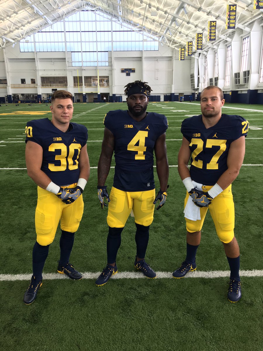
On the uniforms: Nike/Jordan hit an absolute grand slam

If you are sick of the uniform posts stop reading here and refrain from commenting.
But it needs to be said one final time what an absolute first class job Brand Jordan and Nike did with the entire apparel transition culminating in the release of the uniforms. As a uniform "aficionado" of sorts the Adidas years were a nightmare, from the different shades of maize (first too bright then too dark) to the ridiculous uniform templates. Those days are now long behind us, and the partnership with Nike has restored a sense of tradition and swagger that was missing previously. Being the only university in the country with Jordan is simply incredible and trendsetting. Jordan and Nike brought a sense of modernism to the uniform and helmet without sacrificing what makes our uni's the best in sports. Another big thing is they finally got the shade of maize (amarillo) correct. Just nailed it. Looks absolutely BEAUTIFUL and really pops off the screen without being overwhelming.
Standing O to Harbaugh, Nike, Jordan, the AD, and everyone involved in the transition. Sunday night was fantastic and yesterday was tasteful and cool. Job well done.

But I agree with everything you said.
I don't mind the post, but it takes a bitching bitch to bitch about bitching that hasn't been bitched yet...
Does anybody remember the Font? I dare not say a grand slam...no sir...
...y'er mama???
And another little Easter egg is that the new #5 is actually the old #2 that Woodson wore, but horizontal and rotated 180 degrees.
Sent from MGoBlog HD for iPhone & iPad
August 4th, 2016 at 12:34 AM ^
"May the Forcier be with you!"
I really wanted one of those shirts before it went out of style.
This isn't actually true. It's close, but the 5's top serif is longer and there is an angle on Woodson's number that is missing on the 5.

I have the best angles. The best.
once again correct.
Look, Nike did a really good job overall. That has to recognized.
But the OP and a lot of folks want to call it a grand slam, greatest ever, A+, uniforms are PERFECT! etc., etc.
But that is not really true.
Nike did a very good job, and and lot of things are clear improvements. But fair grading requires admitting that not everything is perfect, and the A+ grand slam designation should not be so gifted so freely.
And look, granting them an A+ on day 1 goes against everything that Harbaugh stands for, which is getting better every day.
Harbaugh would be first to say 'very good job, but how can we make it even better tomorrow? '
Harbaugh is the very first guy to tell his QB in the film room that he may have had an MVP performance, but that he missed a read on this play or should have read the defensive alignment differently on another play. It is all about being honest about what was less than perfect so that the team will improve every day.
If Michigan plays really well in week 1, do you think he is going to say 'A+" to the team? No. He is going to say, great job for the first game of the year, but we have to get better every day up to and including the last Saturday on November, and beyond.
Granting Nike an A+ grand slam from day 1 is incompatible with the cuture Harbaugh is instilling in Michigan football.
So great roll out from Nike. Let's hope they make marginal gains/ improvements/corrections each year.
...no.
Just expressing my opinion. You know. Like every one else on the board, including the OP.
Sent from MGoBlog HD for iPhone & iPad
By replying to this post, you have agreed to the terms stated in the OP that this is the 'last word on the uniforms.'
Sent from MGoBlog HD for iPhone & iPad
Sent from MGoBlog HD for iPhone & iPad
Is it the picture, my eyes, or is the "blue" in fact closer to black? The blue looks too dark but the maize is spot on.
This is how the blue looked before Adidas took over. I think Harbaugh even said something along the lines of "dark dark dark blue, almost black".
August 4th, 2016 at 12:31 AM ^
August 4th, 2016 at 12:51 AM ^
Not so dark it looks like Notre Dame, please. Or Navy. The offical color is "Lapis Lazuli." Darker than royal, bluer than navy.
SNOWFLAKES IN AUGUST. Thanks, needed to hear what you thought separate from everyone else.

Yes, snowflakes in August.
Signed,
The SEC
August 3rd, 2016 at 11:56 PM ^
Sent from MGoBlog HD for iPhone & iPad
Uniforms are perfection.
I wonder if they repaint the endzones to match the new font and maize color. Might as well make the endzones blue if they go through the trouble.
I'm confused.
They paint the endzones every year at Michigan and touch them up through out the year. They're not cut in and sewn like some other fields. It's permanent paint, but they have a solvent that takes it off pretty easily.
Actually, you are correct...I didn't read your post correctly.
That said, they could cut out the endzones and inlay navy endzones with the correct font and shades of maize for MICHIGAN.
Sent from MGoBlog HD for iPhone & iPad
I would love that so much. Blue endzones.
August 4th, 2016 at 12:54 AM ^
The endzone and home jerseys. Too great a divergence will not look good.
Sent from MGoBlog HD for iPhone & iPad
You're saying it should be capitalized? I thought the subtle approach was better myself.

Not gonna lie . . . that uni looks sharp, regardless of what Nike just did.
We are blessed with great colors and the wing helmet. If we don't fuck it up we always look great.
Damn it. I was just about to post my thread about how high players should wear their socks. Maybe next year.
Saw a tweet from Aaron Bills. Thought I saw Jehu flying through the air. Probably close to football ready I'd say.
https://twitter.com/AaronBDesigns/status/760969585130471424
August 4th, 2016 at 12:24 AM ^