OT: Maryland FB Uniform change
From Brett McMurphy, Terps moving the the Red helmets with white script as their primary helmet https://twitter.com/brett_mcmurphy/status/1648048836659617792?s=46&t=XkWAKdcheS-H4uqZ-PnX5g
I happen to like the Maryland state flag and how hard they went with that, but these are really nice.
I like the change. Never understood the state flag thing.
There was way too much going on with those to be a uniform.
I usually think that with uniforms but I actually liked those on the helmet. It has some meaning not just something some random graphic designer came up with. And it was unique. Oh well.
Some random graphic designer did come up with it...in the 1880s.
Media embed isn't working fyi. Just spools.
Yeah, the old helmets were a train wreck. These are much classier.
Gattis already making changes. Taking over the team one cosmetic change at a time.
/s
yeah, they sure love their state flag. it’s pretty cool as far as flags go but doesn’t belong on a uniform imho.
April 18th, 2023 at 12:21 AM ^
We have it everywhere here in Maryland . . . even on oven mitts.
Feels a little Rutger to me but....I don't hate it?
Maybe a badass turtle could have been incorporated someplace.
I was thinking something more TCUish with the horned frog
Or maybe just an ass turtle
If I was Maryland I would double down on the turtle usage. Maybe Oregon east but with less busy designs and such.
Agree. I don't understand their refusal to use the turtle. It's a fantastic logo.
Rutgers was my first thought too.
Those airbrushed helmets were complete monstrosities.
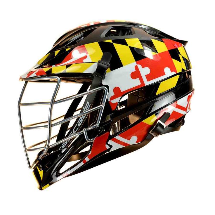
If they wanted to encorporate the flag on the helmets, the lacrosse helmets are a good place to start:

The dumb airbrush graphic gave it the look of a cheap motorcycle helmet:


April 18th, 2023 at 12:25 AM ^
The issue with the Maryland flag helmets is that they look great up close, but from a TV / stands distance they just look like a rust pattern. Too much going on with multiple colors and patterns to look good from a normal viewing distance.
About time. My eyes are appreciative.
agree with you on the MD state flag. it's the only flag that's like...a FLAG
I like it. A much cleaner look
I like it too. Which means they'll probably change it again in 3 years.
The Calvert family is not gonna like this.
Bleh.
I know I'm in the minority, but at least the state flag helmets were interesting.
We now have Wisconsin (at least it's a unique W?), Minnesota, Nebraska Indiana, Purdue, Northwestern, Illinois, and Rutgers that have bland helmets. All are either an initial or the school name spelled out. It's boring.
Michigan and OSU are iconic. PSU's is boring as hell and can be found in any middle school football storage locker (their whole uniform together is cool because of the tuxedo factor but the helmets suck). MSU's is cool because it's unique. Then you have the rest which are again, boring.
I agree with all of that except PSU, those helmets are definitely iconic. The all white uniforms are some of the best in college football. You may have to be somewhat of a minimalist to appreciate it, but still iconic.
Also, MSU's helmets suck. It looks a maxi pad going down the middle.
PSU's whole ensemble is what does it for me. But the helmet on it's own is just too blank.
The center stripe on MSU's helmets isn't great, but the green is a unique color and the Spartan helmet is distinctive.
Which Spartan helmet? They have at least 4 of them.
Specifically, I was referring to the green helmets with the large white stripe, but really they could all use a little more protection.
Completely agree on the helmet. It's like they've forgotten it in the budget since 1950-something. I think an all-white helmet would be an improvement.
I don't like Alabama's helmet for the same reason.
April 17th, 2023 at 10:05 PM ^
An S on the side! SO INCONIC!!!
They should do the Gruffy helmet all the time at least it's interesting and unique.
I agree. The old helmets were at least interesting. And distinct.
While I understand the urge for a cleaner look, I don't think this new version achieves that goal. Less fussy than the state flag, sure. But sorta all red but not really and "Terps" in script means it's still fussy looking.
Like an alternate-universe version of the U of Mississippi helmets.
The U of Maryland paid some consulting / design firm a bunch of money to end up about where they were in the first place.
Back in the day the W was on the front of Wisconsin's helmet..OSU's helmet has changed quite a bit over the years,during the 50's and most of the 60's it had an extremely wide stripe over the top.
Disagree on PSU but agree with the rest of this take. Also - now we have a fifth generic red and white school in the Big Ten, joining Rutgers, IU, Wisconsin and Nebraska. 2 other schools wear red but OSU's gray is distinctive, as is Minnesota's yellow (and their maroon is pretty different too). By comparison, there are 3 blue schools (one mostly white, one mostly orange, one with maize), 3 schools with yellow (all as an accent - one to burgundy, one to black, one to blue), one purple school, two black schools including one that is the only gold school, and one green school.
So the red and white combo is more than a third of the conference and the most overdone combo in the conference. I know Maryland fans are happy about this but for a neutral CFB fan, it's pretty meh.
Don't worry. Some of them soon will switch to black, the only truly manly color—as seen on way too many uniforms and little black dresses everywhere.
I agree. The flag helmet was very distinct. Now they're just one of like a half dozen B1G schools with a red and white helmet.
Has artificial intelligence not advanced far enough to generate a decent looking Maryland helmet?
A bunch of middle schoolers are asking ChatGPT about it as we speak.
What will they do with the rest of the uniform?
And.. upon entering the fine state of Maryland, remember - “Please drive gently.”
These are the helmets MD wore before the state flag monstrosities. I like it! It looks like they're switching the whole uniform back to their trad look. Bravo, MD.
History helps.
Thanks. I thought I remembered these hats from back in the day when PSU played them every year and it wasn't unusual to that game on TV.
Somewhere, Frank Reich is happy. I actually liked the seizure inducing helmets they're going away from.
As is Boomer Essiasin.
I think the flag was more distinctive and unique but Terps fans and blogs preffered the script.
Also - they preferred the turtle to the Maryland block M, which....i def agree with them on. But as a non-terp, I think the goofy unique flag helmets were better for them than the scrip Terps ones. Pro turtle, pro goofy helmets is my position here.
They just want to fit in better with all the other red B1G teams that suck at football.
Boring. Stale. Already been done.
Lived in MD/DC, like the MD flag. Bummer.
Maybe these unis, but with their unique state flag on the shoulders (instead of the stripes) would be a better look?
2023 will be the 85th consecutive Season Michigan will wear the most iconic helmet in the History of College football.