Sparty releases horrible alternative football uniform

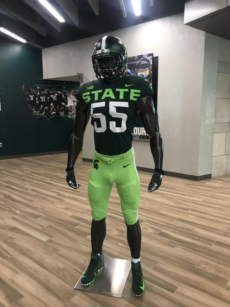
The absurdly large "STATE" is definitely compensating for something.

I don’t know, pretty solid dong outline on that mannequin
He's all balls man!
Why did I go back to look...
Lol, I did the same thing. Something very wrong with that. I just don’t know what.
I noticed before I even read the comment. That's how messed up I am. I was wondering why that manequin was wearing a cup.
Bruh forgot leg day.

Hacks. Spelled STAEE wrong.
you beat me to it... +1
Someone Photoshop plz
All credit to MGoUser "Firstbase"

Revised and updated:

Upvoted
Does it say "Prison" on the back?
"Reform school".......
Rapist - Offense
Racist - Defense
Parolee - S/Ts
Looks like a key lime pie

Every time I watch this I want to see what they are watching on the video feed. Too good.
I refuse to believe this.
Oh, it's real. Originally announced back in April.
And it's spectacular(ly bad)
Need to see it outside. Is that a matte finish?
I don’t need to see that crap in the light of day. What is with the lime green. If I turned on my tv and saw that I would probably be banging on my tv wondering what was wrong with the color setting
Vomitemoji
I don't know. Not crazy bout the jersey, but I love the lime sherbet pedal pushers. :)

I approve. Uniforms that look like energy drink logos are pretty on-brand for Sparty.
Very strong Monster vibes.
The Michigan State Fightin' Kyles
Marshmallow fluff seems more on-brand.

the green in the fluff seems to match the color of the STAEE across the chest
All of the Sparty Kyles approve. hahaha.
A Sparty grad I graduated high school with is a Kyle.
Someone's been rooting through Oregon's trash.
I think these were released back in April or May. Either way, they're still ugly as hell and very fitting for Staee
Yep, this is definitely old news. Nicely done, OP.
Garbage uniforms for a garbage coach and program
Did you hear we (“allegedly”) landed on the moon?
I also heard that Keith Jackson may have passed...
New to me and a great laugh. No complaints.
Who wore it better?
Not gonna bash the OP but I’m pretty sure this was discussed here months ago when this picture was leaked...
To be fair to the OP, I don't remember this at all. Or maybe I just chose not to remember...
I for one appreciated the reminder, so hopefully I don't spill my beer out of shock that first weekend.
Really, take away the STATE and they look rather doable.
I think it’s the three colors that makes them SO hideous. Just go dark green and lime green, or lime a white. All three makes it too busy on top of being already obnoxious.
Horrible - but perfect for them.
Good idea going by just "State". Very distinctive.