Cease Specific Uniform Panic, Revert To Vague Unease


kitten does not like
David Brandon was on WTKA discussing the new(!) varsity lacrosse programs, which you know all about, when he was asked about your favorite newspaper's purported stripey Michigan night game uniform thing:
Michigan athletic director Dave Brandon was asked during an interview on WTKA-AM (1050) this morning if that was an accurate representation of U-M's uniform.
"No," Brandon said.
Brandon said Michigan's uniform would combine "elements of a couple different eras," but emphasized that the final product has not been revealed.
Before you point and laugh at the Free Press, a good source indicates the mockups everyone's gnashing their teeth about are "one of many possibilities," one that ended up "in the top two or three." The final result is not going to be like the "1960s look" Brian Kelly said Michigan was going to bust out in his press conference. That was never on the table because, as mentioned, the uniforms of the 1960s are hardly different than today's. The end result is going to be spiritually similar to the above: a throwback that attempts to go way, way back—source says "foot-ball yore"—and in doing so discards any pretense of historical accuracy.
This or something like it got so far down the pipe that the biggest holdup is the lack of a number on the front. Brian Kelly hates that because it makes it harder to track the opposition's substitutions. (As the kind of person who obsessively tracks his own team's substitutions and gets irritated at teams who don't put names on their jerseys*, I get that.) Michigan is hoping they can get away with a small number like a C or A on a hockey jersey above the block M or that numbers on the helmets will suffice.
So while it's possible the giant raspberry emitted by the public sees Michigan change direction on this specific design, the end result here is going to be an ungainly Frankenstein that no Michigan player has ever worn before. As Eleven Warriors' Ramzy said: "here, have some of our Pro Combat nightmare juice." The only thing that can rescue it is if all the players have Fielding Yost-level lip brooms by kickoff.
But… hey, new scoreboards, right?
*[Penn State excepted for reasons of tradition.]
Hooray that it's not those awful not-real-historical-mash-ups
Boo that they will be some other awful not-real-historical-mash-ups
If you absolutely, positively have to take a leak on the Internet, it might as well be on the freep.com.
When they reveal the jerseys, will they be pumping the Jock Jamz? Nothing says "Michigan Football" like a fake throwback jersey revealed to our famous fight song, "Who Let the Dogs Out"!
can we get gloves with special design so that when you do the zoltan Z it makes an M or something
/kidding, i think
I can only hope DB has learned from the outcry against those leaked jerseys and puts something respectable together
i wouldn't be surprised if they were purposefully leaked to gague popular sentiment.
you know how painful that can be.
I mean, like, gague me with a spoon. Totally.
What? We're throwing back to the 1880's? My bad.
Dear Dave:
Go with your gut on this one. Don't let public opinion sway you from busting out those way cool throwback's you floated up recently.
Trust me - EVERYBODY loves the old stuff.
Sincerely,
The Denver Broncos

This was their original uniforms and color schemes when they entered the AFL, so as hideous as they were, it was authentic.
I don't think those are that bad. Those uniforms are more original than what they wear now. Why did brown become an off-limits color for uniform designers?
Brown is off limits for these two reasons:

Whew, crisis averted. I like the idea of having a M or something on the front with the small numbers ala Hockey C or A, in the corner. That could be pretty slick for one game. How about some leather helmets while we're at it.
That's the ticket!

Is Notre Dame excepted for not having names on their uniforms? They've kind of gone back and forth with names over the course of their history.
Notre Dame is unexceptable!
If the net sum looks classy, and you can point to all of the component parts and tell a story from which era they are copied from, I'm happy with it. If it has arm stripes that look identical to nothing previously worn and psuedo-old timey cell stiching that did not ever appear to have been used, kill it with fire.
If it has arm stripes that look identical to nothing previously worn
See "1891" in the picture tbmike23 has posted in this thread.
Those appear to be rugby stripes, and I wouldn't mind the incorporation of those in a uniform. The Freep model's are of a much narrower width, like bi-colored ref stripes. There were a few older uniforms that had a handful of narrow stripes on the sleeves, but never in an obnoxious pattern like that.
I want the front of the jersey to have Horace Prettyman's junior year photo in the way cool "U of M" sweater.
the jerseys display something evoking die marke mit den drei streifen, then I propose something along the lines of what Greg at MVictors.com came up with last week. Only difference would be three stripes going in the opposite direction.

This wouldn't fly, either. Anything vaguely 3-striped to mimic the Adidas logo would violate NCAA rules over the number of manufacturer logos you can have on a jersey, as well as the size limitations of a manufacturer logo.
Maybe I'm wrong, but haven't some basketball uniforms sported the three stripes on the shoulders? (I want to say Wisconsin has, but I'm not positive.)
Basketball:
"...a single manufacturer's
logo IS permitted to appear once on the game jersey and must be located
between the apex of the neckline and the shoulder seam (per NCAA Bylaw
12.5.4). This logo cannot exceed 2 ¼ square inches."
Football:
"Uniforms and all other items of apparel (e.g., warm-ups, socks,
headbands, T-shirts, wristbands, visors, hats or gloves) may bear only
a single manufacturer’s or distributor’s normal label or trademark
(regardless of the visibility of the label or trademark) not to exceed 2-1/4
square inches in area (i.e., rectangle, square, parallelogram) including
any additional material (e.g., patch) surrounding the normal trademark
or logo."
But the question remains: do three stripes, running down a sleeve (or part of it), constitute a "manufacturer's logo," or just part of the design?
in any form will not end well.
base it off of this
http://i698.photobucket.com/albums/vv348/archangel2k12_bucket/Untitled.jpg
Sorry! embed fail
Revert to vague unease!?! Alright!!!!!
hates softball jerseys with numbers only on the back -- which is what a number of local high school teams have -- I have to say: that rule about having numbers on both back and front is the best rule ever created.
all the jerseys should be sent down to flood-ravaged towns along the Mississippi, filled with sand, and piled along the levees.
you guys are acting like a bunch of little girls arguing about how to dress their barbies. why does it matter?
Someone obviously doesn't "Get it," for those of us who read UniWatch on a daily basis...
The long sleeves they wore once upon a time in '04 (that is 1904) closely resemble the new Nike Pro Combat sleeves. They had long sleeved blue undershirts with an off color padded elbow. I like the look of the all-maize '64 kit with numbers on the winged helmet, add the blue longsleeved undershirt with maize paded elbow, and blue socks and we're styling.
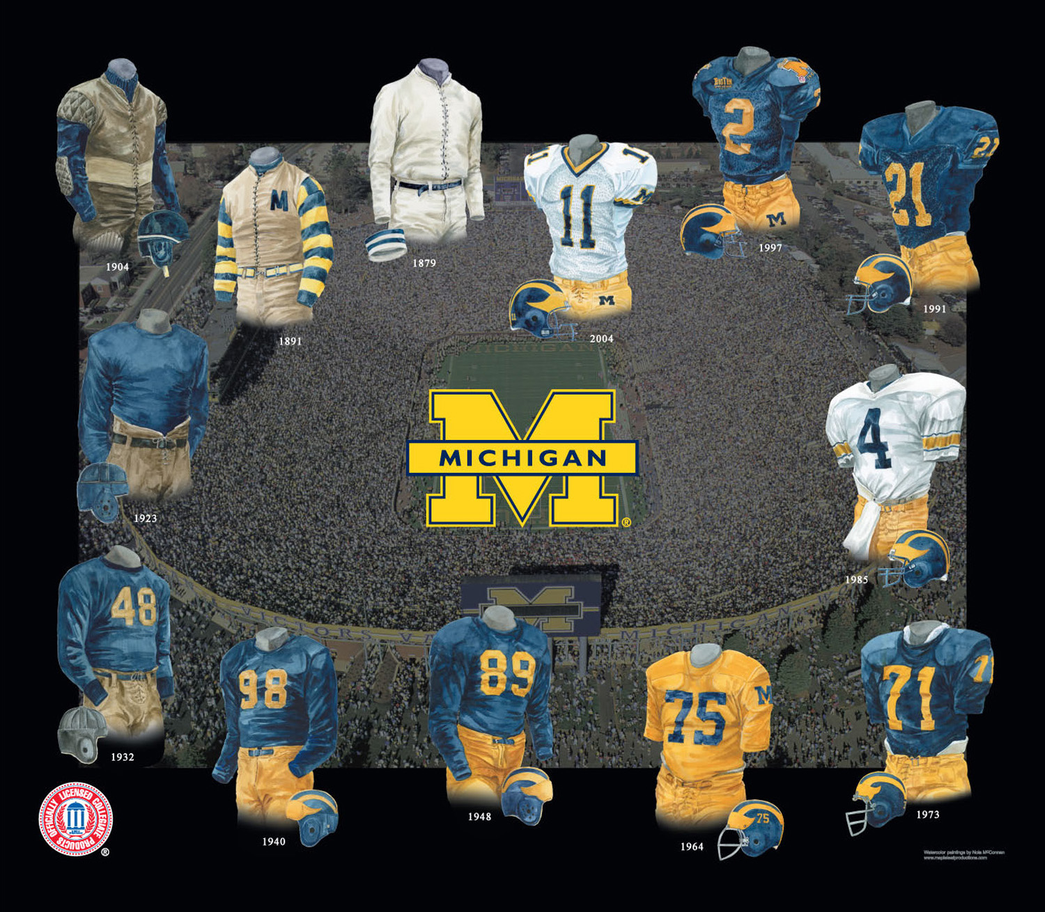
I don't think that 1964 rendering is correct. I've asked some older fans about this and no one can ever recall us wearing a maize jersey.
Those folks tend to be senile and repeat themselves.
[Edit -- OK, this joke doesn't work nearly as well now that jmblue has edited his second post . . .]
They existed, but were worn only in practice, never for a game, I've seen that in other threads here, can't quote it now though
It's been debunked a million times. Pretty sure Jim Conley even weighed in at one point saying it was only ever used in practice.
Brian really should just throw it in the site FAQ or something, because I feel like that drawing gets brought up just about every time a uniform topic shows up.

Well, well, well, if it isn't our friend 504 Time-out. I've missed you, buddy!
And say the 2004 edition isn't quite right either. I'm pretty sure no one wore #11 that year.
Obviously this was a nod to Braylon that was forced to add a second "1" to the jersey for whatever reason.
1904 model FTW. Leather lace-up front. However, this should only be allowed if Hoke grows a Yost-like 'stache.
Would love to see either of the ones from the 1800's, especially 1891. That's a sharp looking outfit.
I'm not sure if we know something or not, but I noticed that Brian said:
" or that numbers on the helmets will suffice"
Which numbers are those exactly. Will the throwbacks include a helmet with the numbe on the side. We had those once. It wasn't the 1800's tho.
I know I'm in the minority, but those designs grew on me. My first reaction was "What the hell is that?!" But the more I looked at them, the less I hated them. Now I kind of like it.
Just tossing a dissenting opinion out there, I guess.
I'm not a huge fan of the stripes, but I like the jersey otherwise. The M on the front is cool. Unfortunately, I guess it's not allowable.
but you're in my minority -- I kind of like it as well. The horrified reaction here was overwrought.
I'm a retro junkie... Those stripes were all the rage back in the 1910's. All depends on how they'd look on a full uniform, I suppose.
This might also be unpopular, but I loved the socks from the retro Denver Broncos uniforms pictured below.
When the actual M night game jersey is unveiled, are you going to make a Lego guy wearing it? That would be amazing.
While I think the M on the front is the best part, I actually also like the stripes.
uniform numbers front and back are an ncaa requirement. the rule is specific enough to specify minimum sizes (8" on the front, 10" on the back) and stroke width (approximately 1 1/2").
apologies if i'm misreading the post.
Comments