OT: Michigan Baseball Uniforms and the Milwaukee Brewers
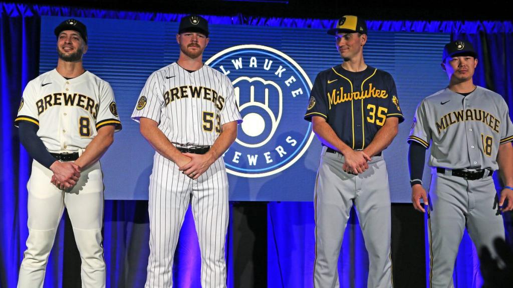
The Milwaukee Brewers just announced their new uniforms starting next year and I can't help but notice the similarities between these and the current College World Series Runners-Up. I'm not the only one who's noticed as it's been pointed out by current MLB players and reports.
This might turn me into a Brewers fan. (And for those of you who thought this was a WD post, it's not lol).

I mean...

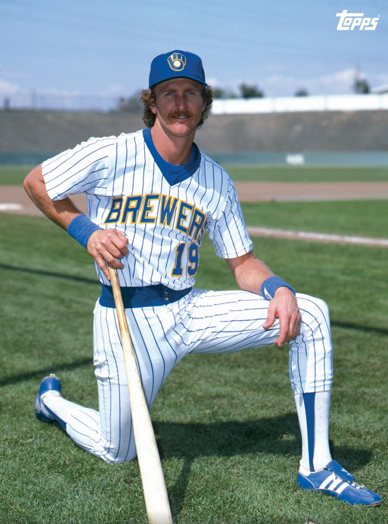
Here's a picture of their new collection. They also use to have the skinny Block M as their logo back in the day.
Imitation is the sincerest form of flattery.
November 19th, 2019 at 9:46 AM ^
Milwaukee sucks
November 19th, 2019 at 9:47 AM ^
I just came to complain about this post.....before the other complaints about this post.
November 19th, 2019 at 9:48 AM ^
What the actual fuck Milwaukee? They even copied our pinstripe alternates.
November 19th, 2019 at 9:50 AM ^
I'm surprised I beat you to this
November 19th, 2019 at 9:55 AM ^
Well, it's not on MDen.
November 19th, 2019 at 10:50 AM ^
Mimicry is the best form of flattery.
November 19th, 2019 at 10:02 AM ^
Thought you would first point out the difference in color between Maize and Yellow.
November 19th, 2019 at 11:07 AM ^
Let's not get carried away. They are baseball uniforms, which are often known for being clean and classic. You can only do that in so many ways. Michigan's are great, but I would guess that other schools/teams have used a similar version.
Besides, who cares if they did copy them? It's not like the two teams play one another.
November 19th, 2019 at 12:21 PM ^
I hate to break it to you, WD, but...
November 19th, 2019 at 12:24 PM ^
Almost certainly not Milwaukee's doing. Both teams are rep'd by Nike. I'm sure Nike basically just reworked a design that worked well for them
November 19th, 2019 at 9:49 AM ^
I'd buy* it more if they put an M on the hat.
* "Buy" as in believe, not as in actually paying money for a jersey.
November 19th, 2019 at 10:03 AM ^
I suppose it's no surprise that Nike is outfitting the Brewers. They're kinda known to repurpose popular designs.
November 19th, 2019 at 11:14 AM ^
Nike is outfitting every team, they took over the contract from Majestic.
November 19th, 2019 at 10:07 AM ^
Guys, really? They look like any other uniform with a different color scheme. If the Tigers were blue and yellow, they would be the same also.
November 19th, 2019 at 10:12 AM ^
Fair enough, but the Brewers even changed the tone of their blue for these uniforms and darkened it.
November 19th, 2019 at 10:08 AM ^
Well, I'm a regular visitor here, but Milwaukee has certainly had its share of visitors. The French missionaries and explorers were coming here as early as the late 1600s to trade with the Native Americans.
In fact, "Milwaukee" is an Indian name and pronounced "mill-e-wah-que" which is Algonquin for "the good land."
November 19th, 2019 at 10:13 AM ^
We are not worthy of this post.
November 19th, 2019 at 11:44 AM ^
Bando, I see what you did there.

November 19th, 2019 at 11:13 AM ^
Upvote this post
November 19th, 2019 at 12:10 PM ^
Unfortunately Wayne and Garth weren't quite accurate. "-waukee" is French slang for water. Milwaukee is named after a mill pond that was created on the Milwaukee River in what is now the Third Ward. This is where Old Milwaukee moved production from a small village west of Milwaukee, after realizing that many people wouldn't want to drink beer called Old Pewaukee.
November 19th, 2019 at 12:25 PM ^
"-waukee" is French slang for water.
Hmm, I speak French but have never heard of this. I'm pretty sure it's of Native American origin.
November 19th, 2019 at 12:50 PM ^
Well that wouldn't make the joke work then. Because, if you had a choice, would you rather drink Old Mill Water or Old Pee Water?
November 19th, 2019 at 1:10 PM ^
It was Alice Cooper that gave Wayne and Garth the history lesson.
November 19th, 2019 at 10:11 AM ^
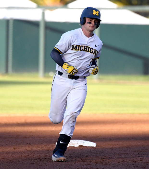
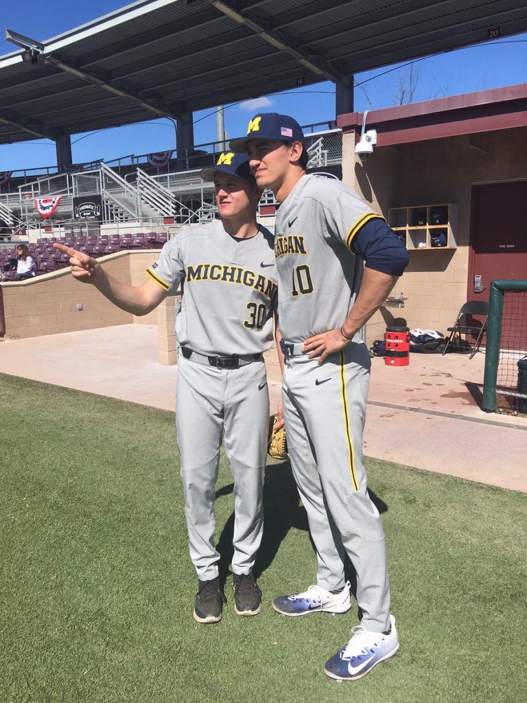
The white, the pinstripe, and the gray are all essentially exact copies of Michigan's baseball uniforms (except the swoosh is on the opposite shoulder).
Now they just need to bring back the hat.

November 19th, 2019 at 10:14 AM ^
I think it's some sort of sneaky way to try to entice Jordan Brewer to demand a trade to Milwaukee.
November 19th, 2019 at 10:51 AM ^
Dear Nike,
Love the flattery, but damn, that's just lazy.
PS: glad the old hats are still around.
November 19th, 2019 at 11:13 AM ^
Nothing could turn me into a Brewers fan....nothing
November 19th, 2019 at 11:14 AM ^
Only so much you can do with baseball uniforms. Ours were copied from someone else, I'm sure.
November 19th, 2019 at 11:18 AM ^
You know that saying that there are only seven types of story plots? Well, there are only like four types of baseball uniforms, so of course two teams with similar colors look like the same.
November 19th, 2019 at 11:38 AM ^
It's like you people have never seen a Nike template before.
With that said, the blue script alternate is gorgeous. And nice to see the ball-in-mitt back. One of the best logos in sports.
November 19th, 2019 at 11:47 AM ^
I highly doubt a professional baseball team decided to copy Michigan's baseball uniforms. They've already worn the pinstripes for Friday home games for a while now, and already had a navy blue jersey with a script "Milwaukee" on it for a while as well.
November 19th, 2019 at 11:55 AM ^
I did always think the ball in glove mb was clever and think it's smart they went back to it, versus looking straight up like Miller's official baseball team that plays in Miller Park and wears the Miller M on their caps.
I guess Michigan could take that script jersey as an alternate to offset?
November 19th, 2019 at 12:21 PM ^
I wish sports leagues would have the courage to tell the apparel manufacturers to put their logos in more discreet locations. The swoosh up there on the shoulder is annoying.
November 19th, 2019 at 3:42 PM ^
To their credit, MLB was the last holdout. The Majestic logo was in a relatively innocuous spot on the sleeve, and there was no maker's mark on the hat until a couple of years ago when they added the New Era flag. But there's a limit to how much money you can say no to until you compromise your morals and aesthetics.
You would think that the pro sports leagues and teams realize that they have brands and logos that are worth billions of dollars, and that they get diluted with every extra logo that is shown. Go to a Tigers game these days, and you see Old English D's and Tiger faces, but also Nike swooshes, New Era flags, Comerica Bank logos, and much more. It's annoying.
November 19th, 2019 at 1:20 PM ^
Nike is doing MLB uniforms now, so there won't be much variety I'd bet.
November 19th, 2019 at 1:26 PM ^
We've got this little misunderstanding. See, they're Mi-chigan, I'm Mi-lwaukee. They got the Golden Arches; mine is the Golden Arcs.
November 19th, 2019 at 2:55 PM ^
I like the minor league team.
The Microbrews. . .
they must have the same unis!
November 19th, 2019 at 3:07 PM ^
Is this really Milwaukee's Best?
The Old Milwaukee uniforns were pretty nice.
November 19th, 2019 at 3:27 PM ^
solid effort with the Beer reference.
November 19th, 2019 at 3:27 PM ^
I always like the simple gray away uniform, looks sharp.
November 19th, 2019 at 3:40 PM ^
Pinstripes should be outlawed.
November 19th, 2019 at 3:46 PM ^
Yes. They don't make any uniform set look better. I will allow the Yankees and Cubs, since they've been doing it forever and smartly do not put words over stripes. But every other team should dump them.
November 19th, 2019 at 4:28 PM ^
All pinstripes are painfully ugly. Those are the 2 specific team unis that should be banned first.
November 20th, 2019 at 6:38 AM ^
I look at it as respect.