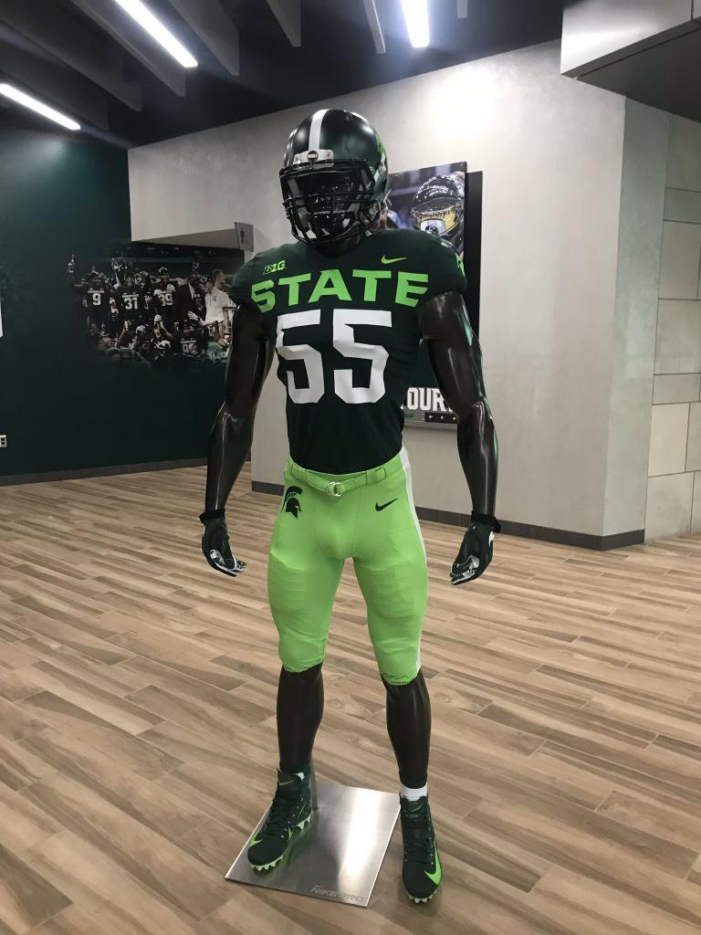
Sparty releases horrible alternative football uniform

That God these are home uniforms, I don't think I could take watching this monstrosity on Michigan's field.
Go ahead. Looks great.

Ewwww, nsfw. Why would you post a graphic image of a Spartan skull cut open with it's brain exposed?
Watching Bachie being forced to sell it does nothing but convince that these guys should be cashing checks if they’re going to be forced to sell this shit to fans.
I see that much like another program that sweeps sexual assault under the rug, these uniforms are horrific.
Taking STATE off would be a step in the right direction.
Nah, it's perfect. They have such an inferiority complex with Michigan that they'd rather take Michigan off their jersey. I love it.
I never looked at it that way before, great point. By the way, how’s your sister doing?
We've been fighting a lot. Fortunately divorce is taboo in the family.
Uhh...we've seen this. They announced it a couple of months ago, I believe.
We saw this months ago.
Well now their offense won't be the ugliest thing on the field
I gave my phone to a blind man and even he said they were hideous...
This is the Spartan football program's cry for help.
Go Blue
They're not that noticeable!
Two comments:
1) This uniform demonstrates the consequences of last year’s losing season under Coach Dantonio.
2) Imagine this uniform along with the OSU black alternative uniform for the OSU - MSU game. Broadcasters shall be rewarded based on their karma.
sports illustrated article was hilarious
https://www.si.com/college-football/2019/08/05/michigan-state-spartans-alternate-uniform-photo
"It seems the initial photos actually managed to obscure how atrociously neon the color scheme is. The pants look like they’ve been dyed with Mountain Dew and there’s a hideous white stripe running down the side of them. "
August 5th, 2019 at 10:42 PM ^
This is the third time I have seen a post here about this stupid uniform...
What the hell is the fascination with MSU and OSU on this blog? It is unbelievable! Every other article is about MSU or OSU.

August 5th, 2019 at 11:22 PM ^
This can’t be real. Come on
Looks like a David Brandon design. Although the bumblebee stands on its own.
From a site called the The Loop - Got a laugh out of me
Originally teased back in April, the CFB world initially gave Sparty the benefit of the doubt (a bad decision, history would suggest). The uniforms couldn't possibly be as bad as they looked on paper, after all. Fast-forward three months, however, and the reality, as it turns out, is far grimmer than anyone could have imagined. The numbers and STATE emblazoned across the chest look like the text size on your grandpa's iPhone. The splash of sea-sick granny apple is bad enough on the torso, but when paired with the toxic chemical spill that are the pants, induces something akin to a pre-frontal lobotomy on unlucky onlookers. The Spartans are predicted to kind of suck this year, but thanks to this atrocity/monstrosity, they will now look terrible while doing so, which is the fastest way to ol' yeller your recruiting hopes short of coach taking the 49ers job before Christmas.
August 6th, 2019 at 10:06 PM ^
https://www.lansingstatejournal.com/story/sports/2019/08/06/michigan-st…
The LSJ included a tweet from our very own WD!
No MSU, it's Orgeon's job to look like a highlighter blew up on their jerseys