Basketball Jumpman Jerseys
In advance of tonight's event, it appears mden was a little overly ambitious in posting photos to their site. Enjoy.
September 30th, 2016 at 2:02 PM ^
MAMA
Gimme Gimme Gimme Gimme Gimme Gimme Gimme Gimme Gimme Gimme Gimme Gimme Gimme Gimme Gimme Gimme Gimme Gimme Gimme Gimme Gimme Gimme Gimme Gimme
Sent from MGoBlog HD for iPhone & iPad
September 30th, 2016 at 3:22 PM ^
My time has come...
September 30th, 2016 at 1:57 PM ^
Damn, those look good.
September 30th, 2016 at 3:46 PM ^
Sent from MGoBlog HD for iPhone & iPad
September 30th, 2016 at 5:36 PM ^
My thoughts exactly.
This, and that I wish they would have used the old Fab Five font for the lettering. I know Nike is trying to be consistent across all sports with their font, but the new font just looks more generic to me.
All told though, great simple design here.
September 30th, 2016 at 7:05 PM ^
Agree...should be upper right thigh, right?
Otherwise, I love them.
September 30th, 2016 at 1:57 PM ^
September 30th, 2016 at 1:57 PM ^
September 30th, 2016 at 3:50 PM ^
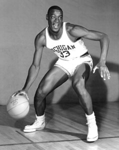
As a member of the basketball and uniform elite, I don't think they bear any resemblance to the "classic" that people tend to think of, a la the Fab Five. The only thing they carried over are the stripe piping and the 'V' taper on bottom of the shorts.
The new workdmark font looks much shorter than the "classic" MICHIGAN on previous jerseys, and the M on the shorts is just too small nowadays. It's not layered/cut/sewn fabric anymore, so make it bigger and it won't add any weight!
Was SO excited for these and this is such a letdown to me.

September 30th, 2016 at 4:02 PM ^
uniforms have changed man. I don't think anybody, even those who pined for a return to the "Fab Five" look really thought that the uniforms would look and wear the way that the Fab Five uniforms actually did. Conceptually, uniforms and really all athletic apparel is just different now. What the Fab Five wore was akin to a golf shirt, pre Tiger Woods. Look across the country, even teams that still wear a rendition of their traditional uniform (Indiana, Kansas), the material and fitting is completely different.
I think most people are just happy that there is no longer different renditions of the "piping" on the shorts and the Block M has returned as the singular focus, as it was in the Fab Five days.
September 30th, 2016 at 6:07 PM ^
"No resemblance?" They have different details, yes. Part of the new, unified color/font program Nike brings that was a dead certainty to be included in the new uniforms. The stripes are different widths. The M is smaller. Stuff like that.
But c'mon, "no resemblance?" There's no piping. There are no color panels. The stripe patterns have different widths but are in fact the same stripe orders as the Fab Five uniforms. This is not a "throwback" uniform designed to look identical to the Fab Five era, but it is the same classic uniform design, modestly updated with modern styling and the new font.
I can understand prefering the old way, but it's not happening. The whole point of a "unified font" is that every uniform has the same font, after all.
If you look at what Nike and Adidas and Under Armour have produced for their schools, this uniform is simple and classic. And while it's not the same as the Fab Five uniform, it does rather strongly resemble it.
September 30th, 2016 at 7:04 PM ^
At least we're no longer wearing these.
September 30th, 2016 at 8:09 PM ^
Thank God. No more railroad tracks. When I first saw them, I thought they were wearing bloomers. LOL!
October 1st, 2016 at 12:11 AM ^
A distant relative of Zubaz ...
September 30th, 2016 at 1:58 PM ^
The Jumpman logo on the shorts looks out of place. A very odd location, to me.
September 30th, 2016 at 2:06 PM ^
I thought so too. Why not right above the block M?
September 30th, 2016 at 2:10 PM ^
originally wanted to dismiss this as a petty complaint, but it does look weird now that I am fixated on it.
September 30th, 2016 at 2:26 PM ^
That is a very strange location for it. It almost looks like someone just photo shopped it on there.
September 30th, 2016 at 6:06 PM ^
Looks like the jumpman is in about the same place.
September 30th, 2016 at 2:30 PM ^
I was thinking more toward the right side along the waist line.
September 30th, 2016 at 8:07 PM ^
I agree. Think it is floating in space where it is right now. Would look much nicer, and balanced, by being placed above the block M.
September 30th, 2016 at 2:13 PM ^
I didn't notice it at first. But now that you mentioned it, I can't for the life of me unsee it.
September 30th, 2016 at 2:16 PM ^
Yeah, it needs to be higher. Like on the football pants.
BUT that is the only tiny knitpick I can make. Well done.
September 30th, 2016 at 2:26 PM ^
I wonder if once they're on real people the M will be more on the side and the jumpman more in the front, making their proximity (and apparent misaligmnent) less?
September 30th, 2016 at 2:32 PM ^
Nike's been putting the swoosh there for a while... Although the Jumpman seems to be centered more on the leg.

September 30th, 2016 at 3:14 PM ^
Fuck Duke
September 30th, 2016 at 2:33 PM ^
Quick image search for OSU and MSU basketball shows that that's where Nike likes to put the swoosh as well. Looks weird, but apparently that's what they do. It looks weirder here because the M is higher up above the piping / hem cutout (last OSU ones I saw have similar piping but no cutout, with the O logo in the triangle formed by the piping - I prefer these Michigan shorts, but it does make the Jumpman placement awkward).
September 30th, 2016 at 2:41 PM ^
Someone mentioned earlier that they think it will look less awkward once we actually see them on players. That very well could be the case.
September 30th, 2016 at 2:41 PM ^
September 30th, 2016 at 4:54 PM ^
You guys really wanted the logo on the butt cheeks so you can check out Wagner all game. I know you better than you think.
September 30th, 2016 at 1:58 PM ^
Sent from MGoBlog HD for iPhone & iPad
September 30th, 2016 at 2:38 PM ^
But White Shorts Matter!
September 30th, 2016 at 1:59 PM ^
Sent from MGoBlog HD for iPhone & iPad
September 30th, 2016 at 1:59 PM ^
September 30th, 2016 at 1:59 PM ^
Sent from MGoBlog HD for iPhone & iPad
September 30th, 2016 at 2:01 PM ^
Finally the shorts are back to what they were in 1990's. Get off my lawn.
September 30th, 2016 at 5:37 PM ^
Now if these whippersnappers would just trim the length back to the Gary Grant era, the shorts would be perfect.
September 30th, 2016 at 2:26 PM ^
Is it just me, or does it look like the shorts have pockets?
Players could carry some loose change in case they pass a vending machine. What will Jordan think of next...
September 30th, 2016 at 2:59 PM ^
I thought the same thing - there's definitely a seem right down leg where you would expect a pocket to be . I love basketball/lacrosse/gym shorts with pockets but they're not really necessary for the dudes who actually have to wear them
September 30th, 2016 at 2:02 PM ^
Sent from MGoBlog HD for iPhone & iPad
September 30th, 2016 at 2:02 PM ^
September 30th, 2016 at 2:02 PM ^
September 30th, 2016 at 2:02 PM ^
am going to really miss the tire tracks on the shorts from last year. Those did not make our team look completely ridiculous at all.
September 30th, 2016 at 2:04 PM ^
September 30th, 2016 at 2:04 PM ^
The whites sortof reminded on a jersey from long-ago that looked pretty sweet too. Just missing the yellow piping and Jumpman back in 66.....


