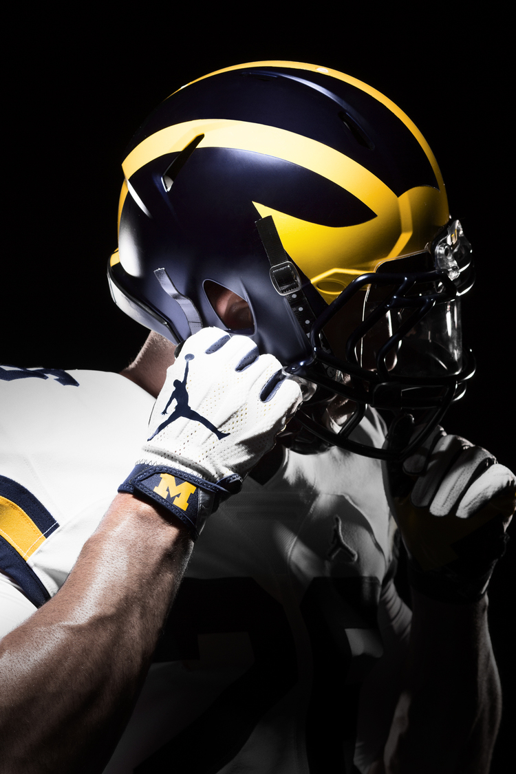
Matte Helmets in 2016

I like shiny things.
Is that you?
you know DAMN WELL i am your father!!! That dude is just some idiot your slut-mother monkeyed around with!
You disgust me.
you were drunk and passed out before you could...well, you know...
Is that you?
is time the apes and hominids stop libeling our suborder.
Get back to us when you have evolved enough to not need a tail.
produce viable offspring.
It's science.
Halfbreed lives matter.
SQUIRREL!
like bullets?
too soon.
I'm pretty sure from the detail photos that the finish on the blue is not matte but satin. Its got a bit of shine, but not nearly as much as the maize.
I have a feeling these will actually look pretty sweet on gameday, and not as matte as the 2013 Outback Bowl.
Here's the two different ones:
NEW
OUTBACK

Sent from MGoBlog HD for iPhone & iPad
the matte helmet trend is the best (and arguably, the only) great uniform trend in the last 10 years
If everyone was jumping off a bridge, should you do it too?
Get off my lawn.
We are Jumpman now, FWIW
Sent from MGoBlog HD for iPhone & iPad


the design HAS changed over the years tho...


August 2nd, 2016 at 11:01 PM ^
Sent from MGoBlog HD for iPhone & iPad
Love it. If I recall correctly, we had these for a game a few years ago and I thought they were slick.
that was for a bowl game and only the blue of the helmet was matte, the maize was not.
Well he nearly did!
Calm down, don't jump off a ledge or something

Shit...too late
Richard, do you want to get shot???
Sent from MGoBlog HD for iPhone & iPad
Agreed. This is one of the better quality images they sent out and it looks like only the blue is matte:

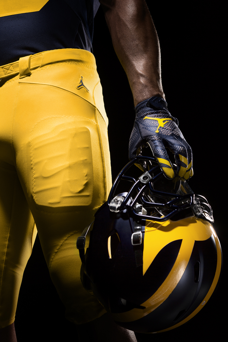
I am one of the most get-off-my-lawn people on this blog, but I have to say, those helmers are really nice. The matte is subtle, and the overall helmet looks really nice. Honestly, i am not sure I would have even noticed that this was matte if it wasn't pointed out.
On a broader note, I think that the whole uniform from Jumpman looks really sharp.
Sent from MGoBlog HD for iPhone & iPad
Everything about the new uni looks sharp. I wasn't one of those people that hated Adidas, but Nike definitely does a much better job with our football jersey.
Looks amazing. I like it all . . . the shade of maize, the depth and richness of both the maize and blue, the little tweaks here and there like the new number fonts and the matte . . . fantastic!
As I said on the other post, I wonder if what Nike was going for here was something different altogether. It's hard to tell in these photos but this doesn't look like a "traditional" matte, rather something in between glossy and matte. My guess is that Nike was going for a light reflection similar to that of leather.
Those who want people off their lawn because of the move away from glossy helmets are forgetting that before them, there were probably even older people wanting whippernsappers off their lawn when original leather helmets converted to plastic.
If an iconic leather helmet sheen is what they were going for, it would actually be a pretty clever troll by Nike.
I don't know how anyone could say the helmets don't look amazing!