We're Not Sure What "Uniform" Means

It's cool, guys. We're just in our teal phase.
![images[1]](http://mgoblog.com/sites/mgoblog.com/files/images1_0.jpg "images[1]")
![0514_large[1]](http://mgoblog.com/sites/mgoblog.com/files/0514_large1.jpg "0514_large[1]")
![image[1]](http://mgoblog.com/sites/mgoblog.com/files/image1.jpg "image[1]")
Ty Cobb; Al Kaline and Harvey Kuenn; Magglio Ordonez
![gordie-howe-9-01157697_display_image[1]](http://mgoblog.com/sites/mgoblog.com/files/gordie-howe-9-01157697_display_image1.png "gordie-howe-9-01157697_display_image[1]")
![images[1]](http://mgoblog.com/sites/mgoblog.com/files/images1_1.jpg "images[1]")
![96352924.jpg.24745_display_image[1]](http://mgoblog.com/sites/mgoblog.com/files/96352924_jpg_24745_display_image1.png "96352924.jpg.24745_display_image[1]")
Gordie Howe; Steve Yzerman; Henrik Zetterberg
![p1_laimbeer[1]](http://mgoblog.com/sites/mgoblog.com/files/p1_laimbeer1.jpg "p1_laimbeer[1]")
![teal-pistons[1]](http://mgoblog.com/sites/mgoblog.com/files/teal-pistons1.jpg "teal-pistons[1]")
![Ben_and_Chauncey_medium[1]](http://mgoblog.com/sites/mgoblog.com/files/Ben_and_Chauncey_medium1.jpg "Ben_and_Chauncey_medium[1]")
Bill Laimbeer; Allan Houston and Grant Hill; Ben Wallace and Chauncey Billups
![tom-harmon[1]](http://mgoblog.com/sites/mgoblog.com/files/tom-harmon1.jpg "tom-harmon[1]")

![TomBrady_1[1]](http://mgoblog.com/sites/mgoblog.com/files/TomBrady_11.jpg "TomBrady_1[1]")
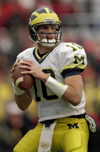
Tom Harmon; Jim Mandich; Tom Brady
UPDATE: someone said the "fair comparison" is the changes in Michigan's away uniforms over the years, as if 1) the Notre Dame game was not at home, 2) Michigan changed their away unis three times in a season, four if you count helmet numbers, back in the day 3) and looking stupid is acceptable as long as it's a road game. Here are the incredible changes in the last 40 years.
![1971msu[1]](http://mgoblog.com/sites/mgoblog.com/files/1971msu1.jpg "1971msu[1]")
![Ya-know-Jim-Harbaugh-never-really-looked-that-happy-at-Michigan-anyway[1]](http://mgoblog.com/sites/mgoblog.com/files/Ya-know-Jim-Harbaugh-never-really-looked-that-happy-at-Michigan-anyway1.jpg "Ya-know-Jim-Harbaugh-never-really-looked-that-happy-at-Michigan-anyway[1]")
![746f17ef70803e54244c58a8c2c43dec[1]](http://mgoblog.com/sites/mgoblog.com/files/746f17ef70803e54244c58a8c2c43dec1.jpg "746f17ef70803e54244c58a8c2c43dec[1]")
1971 MSU program; Jim Harbaugh; Mike Hart
![Michigan-Notre%2BDame%2BThrowbacks%2B2011[1]](http://mgoblog.com/sites/mgoblog.com/files/Michigan-Notre2BDame2BThrowbacks2B20111.jpg "Michigan-Notre%2BDame%2BThrowbacks%2B2011[1]")
![aa43[1]](http://mgoblog.com/sites/mgoblog.com/files/aa431.jpg "aa43[1]")
![BG120-2[1]](http://mgoblog.com/sites/mgoblog.com/files/BG120-21.jpg "BG120-2[1]")
Dave Brandon; Dave Brandon; Dave Brandon
December 13th, 2011 at 2:47 PM ^
The fair comparison would be to show the variations in the away uniforms over the years.
December 13th, 2011 at 3:13 PM ^
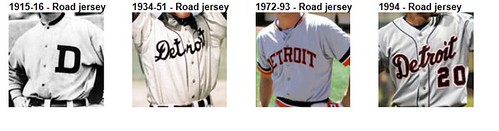
Detroit Tigers away jerseys vs time:
http://detroit.tigers.mlb.com/det/history/uniforms_logos.jsp
You win.
December 13th, 2011 at 3:17 PM ^
This is a good place to look, too:
http://exhibits.baseballhalloffame.org/dressed_to_the_nines/uniforms.as…
December 13th, 2011 at 3:20 PM ^
...and they use different Ds on their caps vs jerseys.
http://www.nickconflitti.com/blog/the-detroit-tigers-old-english-d/
I like these jerseys, but having so many in one season does seem a bit much.
December 13th, 2011 at 3:08 PM ^
Uhm, sorry...think I had a flashback ....(I might have been in that audience with Houston and Hill...)....
But yeah, you're right. The home ones have been uniform till UTLs, but the roads have been changing almost annually since Nike became NIKE, and Adidas hasn't stopped. I'm not sure that a couple of blue stripes on the shoulders (and a tiny block M, that doesn't look bad) is any worse than yellow piping that became full on stripes up the sides. If you weren't completely freaking out about that, this doesn't seem any worse. It's not the bumblebee uniforms from MSU. THAT was really different. This...eh. Rather they only do one of these a season, rather than trying to milk it all in one year (because who knows what they'll be reduced to when they've used all these up). But was this a lot better?

(I mean, you can see the yellow stripes UP THE BACK!!)
Edit to the Edit-
Ok, which of the three are the most alike?

December 13th, 2011 at 3:10 PM ^
Probably not the best choice to go with an off-brand, fake Woodson jersey.
December 13th, 2011 at 3:19 PM ^
Other than the sleeve and collar stripes (OH NO, SLEEVE STRIPES), it is basically the same.
Is Tom Brady iconic enough for you? (LITTLE BLOCK M's ON THE PANTS...NOOOOO)
December 13th, 2011 at 11:04 PM ^
Exactly.
December 14th, 2011 at 12:23 AM ^
I'm not sure that a couple of blue stripes on the shoulders (and a tiny block M, that doesn't look bad) is any worse than yellow piping that became full on stripes up the sides. If you weren't completely freaking out about that, this doesn't seem any worse.
I was pretty much freaking out about those too. I wish folks would stop using those as an example as in "these were OK, so the Sugar Bowl ones are OK too!" Those were not OK. Those were stupid-looking. And they were a template, which made them even worse. Having those was a mistake, not an excuse for having these.
December 13th, 2011 at 3:07 PM ^
You miss the point entirely, but your wish is my command.
For people saying they "like these," there is no "these." There is only a steady procession of dumb ideas, some of which are not quite as awful as the others. The point is when you have a good idea, you stick with it, because good ideas are rare and **branding is about consistency.**
Unless you're explicitly not about consistency, like Oregon. We are not Oregon, and trying to be Oregon hurts us. Dave Brandon knows how to direct mail old people about crap they don't want and how to sell crappy generic pizza. He evidently has no idea how to care care of an established, beloved brand.
December 13th, 2011 at 3:12 PM ^
Except the away jerseys aren't really an established or beloved brand, at least not nearly as much as the home jerseys.
December 13th, 2011 at 3:50 PM ^
I find this reasoning borderline nonsensical. A strong brand is about every single thing the brand touches. So we can do stuff to 30-40% of our teams uniforms because away unis aren't established as much? That is an argument for MOAR consistency not less. Do we play a lot of away games on TV, I can't remember?
December 13th, 2011 at 3:59 PM ^
The away jerseys have changed frequently over the years, and thus are not an established or beloved tradition, as Brian stated. The away jerseys matter, but it is unfair to liken them to our home jerseys or established classics like the Red Wings, Tigers, and our very own home jerseys.
December 13th, 2011 at 4:02 PM ^
But ok.
December 13th, 2011 at 5:56 PM ^
I think that most of us would be ok with SUBTLE changes to the away jerseys. Hell, I even like these jerseys, where the changes are not so subtle. The problem that many of us have is with wearing 6 jerseys in a season (Home, home piping, UTL, away, MSU and now these). We are not Oregon, nor should the winningest program in CFB want to become Oregon. This is Michigan, fergodsakes.
Again, changes to the away jerseys from time to time are fine. But, several changes in a season? Silly.
I would like to see us keep the home jerseys, settle on nice away jerseys (even these would be fine). Then, since anything less is unrealistic, wear one "special" jersey for an away game other than OSU - ND? MSU? Perhaps Nebraska or Wisco? Some road night game?
Then, for the bowl, go with the regular home or away, but add the patch like we have always done.
December 13th, 2011 at 7:30 PM ^
I don't get the uproar here. The change IS subtle. Two whole stripes, and they're blue. I rather like them, actually, more than any other away jersey they've had (especially the abomination they showed at MSU).
I get being upset about the number of changes so quickly. But that seems like a minor issue to me.
December 13th, 2011 at 8:01 PM ^
I say this with respect for your opinion, but you and I have different definitions of subtle. To me, subtle are things you might miss unless you're looking closely (eg., piping, or thin stripes at the edge of the sleeve.) Broad stripes on the top of the shoulder pad? No way to miss these, thus I consider them a significant jersey change (which I'll consider as long as 1) it's the away jersies, and 2) it happens exactly one time a year.)
December 13th, 2011 at 9:05 PM ^
Agree to disagree. It still looks subtle to me...we're looking at away unis that are largely solid white with maize pants, which is exactly what the jerseys have always been.
Adding a couple broad stripes isn't really all that different from, say, having the player's number on each shoulder in blue numbers (which has been done in the past). Since it's not a giant design change in my mind, it's subtle.
On the contrary, the MSU away jersey abomination was not subtle because there were bumblebee stripes, alternating in yellow and blue, which was basically the focal point of the jersey and pretty hard to miss even with a casual glance.
December 13th, 2011 at 4:49 PM ^
I would understand if Brandon & co decided to update the away uniform every ~two years if it was found necessary, for whatever reason, b/c it is not as established. But to have a different uniform basically every other game (remember, we have a grand total of 5 away games this year, counting the Sugar Bowl) is ridiculous.
It doesn't make it a uniform; it makes it a kid's playtime costume -- "today I'm a bumblebee!", "look, now I'm an airline pilot!"
December 13th, 2011 at 5:09 PM ^
Apart from the move to white pants in the the 1970's, the road uniforms haven't really had any significant changes until now. Most of the changes in the past have been fairly minor: stitching, piping, a block M on the sleeves, etc. From a purely subjective viewpoint though, putting big stripes on the shoulders is a radical change; not at all comparable to these other small details that have varied through the years. Ask someone not intimately familiar with the road uniforms to spot the differences in them between 1978 and 2010, and I'd bet they would be hard-pressed to find them. Then show them the Sugar Bowl uniforms with big stripes on the sleeves, and I'm sure they'd say they were completely different.
This is a dramatic change being passed off as a little tweaking. I suspect it's only going to get worse, considering that Brandon is only concerned with revenue streams.
December 13th, 2011 at 5:24 PM ^
I agree 100%. There is a common-sense factor to this. The away uniforms have been tweaked over time, sure. But - tweaked. Evolved. If we played "which one of these is not like the other" with fans of other teams and the progression of white jerseys from whenever to today, even taking into account the stupid-ass piping and RazorHorn stripes, these ones that are being passed off as "legacy" will stand out like sore thumbs.
December 14th, 2011 at 4:15 PM ^
December 13th, 2011 at 4:02 PM ^
I appreciate the update, actually. I simply noticed that the UM string of uniforms was the only one with mixed representations of home and away. Leaving as an open question whether you think any of it is a good idea, the fair comparison issue is legit. If you wanted to make a point about home uni's being sacred, why include the aways for UM? If you wanted to make the point that all uni's should be sacred, why not include away uni's for the other teams?
As an aside, if I missed the point I apologize. Maybe you could have made the point explicit in the original post.
December 13th, 2011 at 3:14 PM ^
As much as I hate to say it, the more goofy jersey designs I see, the more ads I see in the concourses of Michigan Stadium, the more RAWK I hear, the more "Wolverine Dining/Lodging/etc. Club" ads I hear at Yost, the more I have to pay to even take a look at the inside of the stadium on a non-gameday...
Michigan is eroding into a soulless, corporate, just-like-everyone-else place. And I'm not OK with that. Dave Brandon may wrap everything in some kind of marketing justification that appeals to the lowest common denominator, but that doesn't make it right for Michigan.
Two jerseys, one pair of pants, one helmet (numbers are OK), that's it. This is Michigan, right?
December 13th, 2011 at 3:21 PM ^
You're right, Michigan has always been solely about having a limited number of uniforms.
EDIT: I agree that we shouldn't change uniforms every game. However, I feel that you are vastly exaggerating the extent of the "erosion", and that you are missing the bulk of what Michigan actually is, and what it stands for.
December 13th, 2011 at 3:28 PM ^
It's called symbolism, people. Michigan stands apart from other schools, and one way to symbolize that is by having an iconic, unchanging brand - something that other schools can't do. Anyone can bring out new alternate uniforms to sell more jerseys; the trick that other schools can't turn is selling jerseys because your uniforms are a true icon of the sport and because the same jersey has been worn by Tom Harmon, Gerald Ford, Anthony Carter, Jim Harbaugh, Desmond Howard, Charles Woodson, and Tom Brady.
December 13th, 2011 at 3:50 PM ^
And the same uniforms are still being worn by team 132. We have done some different things with the away uniforms this year, as well as with the uniforms worn for the first night game in Michigan Stadium history. So what? We are still Michigan, we still have Mott's Hospital, we still have the Mealer family, we still carry ourselves with integrity and respect.
Did anyone really prefer having our team go to the Sugar Bowl with mismatched away jerseys with piping on the sides?
December 13th, 2011 at 6:21 PM ^
"Michigan stands apart from other schools" loses meaning when a lot of schools think they stand apart from other schools and when those people don't really recognize that statement about Michigan.
December 13th, 2011 at 11:10 PM ^
It's called reality, people. Get with the Oregon style or get left in the dust.
December 13th, 2011 at 3:21 PM ^
is winning.
December 13th, 2011 at 3:28 PM ^
FERGODSAKES?!
December 13th, 2011 at 4:01 PM ^
in a marketing, branding, corporate or anything else sense. He is 100% wrong from a marketing sense and clearly does not understand the concept of branding at all. Every successful brand in the world has competitive advantage based upon being unique, offering unique expoerience, or being perceived in a unique manner.
He should look to Coke, who has just pulled their "special" Christmas themed cans off of the shelf, because of complaints from their consumer base that they resembled other brands and were not iconic.
Michigan's brand is not solely about success on the field, that is only one of the comonents of it's power and appeal. It's consistency is in fact one of those components.
December 13th, 2011 at 5:50 PM ^
The Coke thing is currently being written up as Harvard Case Study as we speak, I'm sure. I spoke to some relatives this weekend about the white Coke debacle (they're all big Coke-heads) and a couple commented, "Well, it just goes to show no one can read anymore" and I pointed out, that's not it all. When you are a 100+ year brand like Coke, or UM football, people have a deep visceral connection with how the "brand" looks. The red of Coke and its script letters convey something without having even to think about it - virtually any consumer can just look at it and in an instant say, "That's Coke." They don't have to wonder, "Is that regular? Or is it Diet? Or something else?"
Michigan football, b/c of its long-term success on the field and unique (in D1-A) helmets paired with a fairly conservative uniform, has a similar broad appeal. Why Brandon would want to make someone glancing at a TV say, "Wait, is that Michigan or some other team -- Delaware maybe?" is beyond me. It dilutes the brand, all for a few bucks from M-Den.
Please someone create a Tony Montana montage with David Brandon to complete the (other kind of) white coke imagery.
December 13th, 2011 at 6:21 PM ^
and to think brandon wore one of those time-honored uniforms makes it infinitely more puzzling to me.
December 13th, 2011 at 8:33 PM ^
Maybe because I'm not opposed to permanently changing the away uniforms, or maybe because I like your comment and just want to ask, but what about Coke changing their Diet Coke cans? I agree that seeing Michigan changing their home uniforms is similar to Coke cans going white, but I would imagine that Diet Coke cans have changed plenty over the years, and there would be much less opposition to altering those cans. In short, I don't see our away uniforms providing that "deep visceral connection" to fans, and think Diet is a much better comparison.
I don't think it's great to have this alternate uniform stuff going on all season, but in terms of changing the away uniforms, I don't think it dilutes the brand.
December 13th, 2011 at 9:22 PM ^
is an off-shoot brand of the flagship, (or a cousin perhaps) it is most assuredely not the core brand, which is Coca Cola itself. The away uniforms are IMO a core "packaging" of the absolute core Michigan Brand, and should not be looked at as anything less than that. In fact I think in some ways the away uniforms are MORE important than the home (in terms of branding, not to us) because that is how people outside the core fan base (i.e. newcomers to the brand who we would like to influence--think recruits and others) are iften exposed to Michigan.
None of this is to say "no changes ever allowed ever." Leading brands do evolve over time--that is how they stay relevant to new generations. But evolution and 4 or 5 different versions of the uniform are not the same thing, at all.
December 13th, 2011 at 9:55 PM ^
Thanks for the response. It's interesting thinking about away uniforms as being on the same level as the home ones. I'm not sure I agree, but it's definitely something to think about.
To be clear, I don't support all these different versions. I just don't think it's the end of the world to change the away jersey on a permanent basis, as long as it's still recognizably Michigan: same everything but the jersey, white jersey with blue numbers and maybe some maize on it as well. I think this "throwback" would be an okay replacement, but I don't like it as a one-time thing.
December 13th, 2011 at 5:44 PM ^
[Mr. Calrissian's opinion is supported by Fielding H. Yost up in football's Valhalla.]
December 13th, 2011 at 3:15 PM ^
But was there equivalent snark when the yellow stripes came out on the Uniform? Or is it just reserved for things Brandon does? Because if the sky is falling when we get changes like this-
http://www.moesportshops.com/products/view/3365/1
It kind of lowers the importance of when Brandon actually does something really stupid.
(Ohhh, they added a Sugar Bowl patch too...)
December 13th, 2011 at 8:28 PM ^
I snarked.
December 13th, 2011 at 9:00 PM ^
For the record, I snarked too. We had uniforms that were uniquely Michgan's, and then we got slammed with a stupid template. Why people call that OK and then say "because we did that, we can screw with the away uniforms all we want," I'll never know.
December 13th, 2011 at 3:18 PM ^
It's the away jersey. Who cares? It actually looks pretty good. OMGDAVEBRANDONLIKESMONEY. Give it a rest.
December 13th, 2011 at 3:25 PM ^
Except there is a 100% chance this would have happened if Michigan was the home team. The home/away distinction is one Brandon does not care about, obviously, and so people insisting that changing the uni for the fifth time in a single season is anything like what happened before is okay because it's just the away uniform is weird. Yeah, there are stripes and stuff that come and go.
This is a totally different thing. Okay, Michigan makes slight alterations to the away jersey every five years or so. Granted. That has nothing to do with this.
December 13th, 2011 at 3:35 PM ^
Team 132 is 10-2 with a BCS bowl to go, started playing Michigan defense again, and we have an elite recruiting class coming in to go with our now-apparently-elite coaching staff. Who gives a crap what they wear? The players are not your person-sized man dolls, and they like it. Little kids like it, too. Everybody else should be grown up enough to realize it doesn't matter beyond that, especially since the loyalties of actual fans are not dependent on what outfit the players are wearing.
December 13th, 2011 at 3:53 PM ^
I'll take an Alabama defense to go please.
December 13th, 2011 at 3:53 PM ^
That makes no sense. "Nobody's opinion matters except the players and little kids. The rest of you pound sand." As if, in the first place, "the players" are a homogenous, unanimously-thinking group of people that think as one and would, if they hated the uniforms, say so to the media.
December 13th, 2011 at 8:33 PM ^
little kids like mascots too.
But luckily we know NO ONE would dare attempt to fuck with that hallowed Michigan tradition.
December 13th, 2011 at 4:06 PM ^
You have no understanding at all about anything having to do with what makes Michigan unique. Call this into Valenti instead of here.
I'm not necessarioy defending being greatly upset over the unis, but I am defending against "nothing matters but the record." That is clueless.
December 13th, 2011 at 3:48 PM ^
Your ridiculous angst-ridden disgust for DB aside, I guarantee you that slight changes like this do not hinder our "brand". You show someone the winged helmet, I bet you they'll know who it is.
December 13th, 2011 at 3:54 PM ^
I bet you meant to type "what it is."
You know, because a helmet is and never will be a who...
Comments