Ranking Big Ten helmets
The Omaha article ranking Big Ten helmets was linked by Rittenberg yesterday. I didn't post this as a "Yeah, we're number one." As the writer says, "It's obvious". As for the others, I'm less of a fan of the plain like PSU or Nebraska, than others, but whatever. What I found fascinating, however, is the stat that MSU has changed its helmet 16 times since 1960.
http://sports.omaha.com/2011/05/18/ranking-big-ten-helmets/
Penn State #2, Iowa #3...IMO.
EDIT: Challenge flag... Big Blue? Credibility tainted. Here's the list for people who don't want to click:
- Michigan – Obvious, right? Here’s the history of it for Big Blue.
- Nebraska – A clean, memorable look. That N is still a masterpiece of typography.
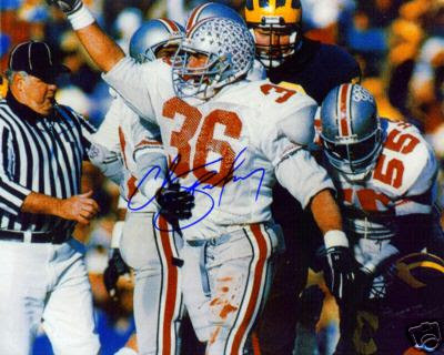
- Ohio State – With a full helmet of Buckeye stickers, of course. Chris Spielman style.
- Purdue – It’s hard to go wrong with gold, but I also like that fast-moving P.
- Iowa – Nothing else like it. Extra points for the “America Needs Farming” sticker on the back.
- Indiana – Liberace’s favorite helmet: The IU looks like a candelabra.
- Penn State – I’m guessing some will rank the Nittany Lions last.
- Michigan State – Its Spartan is no USC Trojan, that’s for sure.
- Northwestern – Good colors, but did a mouse nibble away at that N?
- Illinois – Illini fans must need to be reminded what team they’re supposed to root for.
- Minnesota – Hard to read the trapezoidal-looking M.
- Wisconsin – Let’s face it: The W looks like Clip Art.
Hats
Now I understand why Izzo said MSU has no tradition for its logo. I wonder if people could use any one of the 16 logos commercially and not worry about TM infringement . . .
" MSU has changed its helmet 16 times since 1960."
This is part of the reason why there is no tradition at Michigan State, the only tradition they do have is having at least one member of the basketball team and football team suspended every season.
True, I guess I was a little too nice.
Come on, hot girls, not a virgin on campus, and the strippers are really students paying their way through school. Now that's tradition.
<br>
<br>Tevye
I live in Omaha, I should prolly tell them to never call us "Big Blue" ever again.
Good luck with that.
Course, most of that MSU helmet swapping is just flip-flopping back and forth between a Spartan and an S.
Nobody asked me, but here are the 12 as I say they should be ranked:
- Michigan. Duh.
- Iowa.
- Michigan State. Yes, I'm being that way. I like the Spartan logo.
- Northwestern.
- Purdue.
- Wisconsin.
- Minnesota.
- Indiana.
- Ohio State without weed stickers.
- Nebraska.
- Penn State. I like the whole simplicity look, but that's the whole look. The helmet by itself is so eh and gets its value only from what it does for the uniform.
- Illinois.
- Ohio State when loaded up with weed stickers.
The stupid looking stripe alone should drop them into the bottom half.
Must admit I am liking N to the B10 as they pay proper hommage.
The stripe does suck, but the helmet is a good graphic. It's better than USC's, which has too much detail that is impossible to make out at a distance.
I disagree. USC's colors alone make it far better. I'd definitely have them in the top five overall:
- Michigan
- Alabama
- USC
- Texas
- ND (or 1973-1996 Pitt)
No wai. I've never really cared for USC's colors. And snowcrash is right, their logo just looks like a gold blob. Sparty's is better because it's simpler.
I have to agree with you. There's something I find really satisfying about deep, dark colors, and I like the green they use on their helmets (but not so much the green on their uniforms, unless it's grass stains on their pants from being tackled). USC's color combination has always struck me as quite garish. Similarly, I like ND's colors when they play in that nice deep blue, and I think their helmets complement the uniforms nicely. And say what you will about Indiana's football program, but I love the trident. It's unique, better than a block "I" or spelling out the school.
Obviously I disagree. The Cardinal and gold play really well off of each other, IMO. I know as Michigan fans we automatically hate red, but I love theirs, especially if there's a good amount of light playing off it.
I've been a cream and crimson fan all my life. My dad's an alum, and I grew up rooting for IU hoops under Knight. It's only the bright red I really despise. :-)
And I'll certainly agree that USC's helmet is iconic, if nothing else and if not quite to my personal taste. That's an interesting question, isn't it: which helmets do we like, and which do we find most iconic? Michigan has to top that list for pretty much everyone, don't we?
Ironically enough, that's where I go to school. Definitely agree on the crimson vs. the scarlet.
Also, I'm more of a "chalk" kind of guy, so the helmets known as icons are all my favorites, as I said above. I like that M hasn't had a significant helmet change in 70 years, so the PSU, Alabama, ND kind of helmets and uniforms all appeal to me.
1 UM 2 PSU 3 OSU 4 MSU 5 Iowa 6 Illinois 7 Minny 8 Purdue 9 Indiana 10 Nebraska 11 Wisconsin 12 NW
-
Michigan.
-
Nebraska
-
Iowa
-
PSU
-
OSU
-
MSU (I like green and white, but no consistency means a lower rank)
-
Wisconsin
-
Purdue
-
Northwestern
-
Indiana
-
Minnesota
-
Illinois (Just awful)
FWIW, Yardbarker published a list today. Michigan was number 1 followed by USC. Nebraska and Penn State also made the list at 15 and 17, respectively. My second favorite helmet: Alabama, which checked in at number 4. I just think the red with the number on the helmet is really cool.
That was a fun read over there. Honestly, I was kind of hoping for a beast like Woodley to represent our helmets.
- Michigan
- IU
- NU
- PSU (OSU without stickers)
- Nebraska
- Iowa
- OSU (with stickers)
- Minnesota
- MSU
- Purdue
- Illinois
- Wisconsin
1. Michigan
2. Penn State - Clean and classic
3. Iowa - Hard as nails!
4. Ohio State - Not all is wrong with the enemy
5. Nebraska - Simple is good
6. Purdue - Starting to enter the weak side of the bracket
7. Indiana - Eh
8. Minnesota - Does it still have a gopher on it
9. Wisconsin - Used to be better before it got Lion-ized
10. Illinois - eh
11. MSU - Why do they call us Walmart when all of their gear looks to be from aisle 3.
12. NW - Because it's terrible.
The Michigan and Iowa helmets are the only ones that consistently work for me.
I get (at least I think I do) why people are into Penn State's simple design, but for me it's too close to non-design in the guise of design, if that makes sense. (It may not.) Same idea, largely, for Nebraska ...
I really like PSU's jersey and pants, but the helmet is just boring. At one time they painted numbers on the sides. I don't know why they stopped that.
Girlfriends (who doesn't pay much attention to football) top helmets. This is sure to get negged but WTF, I'll post anyway.
- PSU
- IU
- Michigan
- NU
- Wisconsin
- MSU
- OSU
- Iowa
- Nebraska
- Purdue
- Minnesota
- Illinois
Negged for being a mere vessel to communicate your GF's thoughts with the MGoWorld.
Negged for having a girlfriend who place Indiana's helmet over ours! Or any helmet for that matter... I'm sure she is a nice girl, but a part of me would die if mine said that.
Hence the "knowing I'll get negged". I'm cool with it; it's not like she doesn't suffer through watching games with me in the fall (and winter and spring) so I'm fine with her saying whatever she wants about helmets.
You're not crazy. She DOESN'T CARE ENOUGH!!!
At least that's what I tell my wife when I scream at Ezeh oh shit I need more therapy...
If ZL ever deserved a "normal" vote this post is it.
Mine will watch Michigan football but has yet to get on board with any of the other sports.
1. Michigan
2. Michigan
3. Michigan
4. Michigan
5. Michigan
6. Michigan
7. Michigan
8. Michigan
9. Michigan
10. Michigan
11. Michigan
12. Michigan
'Cuz they spit hot fire.
We should probably rank these and not include our helmets. They're the best in the nation and are arguably the most popular in college football.
Even then, it's kind of hard to rank the rest of them because the majority of them are blah.
Here's an old link to how the Big Ten helmets have changed over the years.
Wisconsin, Michigan St., Minnesota, and Illinois have all actually adopted uglier helmets as the years went on. Pretty interesting find.
Of course Michigan #1 it's tough for me to not like Iowa's helmets. PSU is classic yeah but I don't think the helmet is all that great until you combine it with their uniform the blend works really well.
Michigan State should clearly be last. Their helmet has a picture of a helmet on it. What would people say of our pants if they had a picture of pants on them?
I really feel like the Big Ten as a whole is pretty weak in the helmet category. But here it goes...
1. Michigan
2. Iowa
3. Purdue
4. Nebraska
5. Penn St.
6. Indiana
7. Ohio (w/stickers)
8. Northwestern
9. Minnesota
10. Michigan St.
11. Wisconsin
12. Illinois
I have to give credit to OSU for their helmet. I would say they are #2 behind us in the B1G in that department. I like the metallic silver/gray color and the stripe is cool. I don't like it as much when it is covered in those stupid buckeye stickers though.
- Michigan
- Indiana
- Iowa
- Ohio State
- Wisconsin
- Michigan State
- Nebraska
- Purdue
- Penn State
- Minnesota
- Northwestern
- Illinois
northwestern's colors but why use that particular "N" as the logo, it really ruins it.
Because when they introduced it, it was, like, psychedelic, man.
Overall...
1. Michigan
2. Navy (and not those ugly ND helmets....)
I also rank the B1G like this. I usually put PSU and Iowa closer to the top though...
Big Ten:
1. Michigan
2-10. Everybody else
11. MSU
12. TSIO
1. Michigan
2. Iowa
3. everyone else
Virginia's helmets are very nice. If the football team was better they might get a little more love.
Virginia is an example of how to properly use blue and orange. Illinois is an example of how not to.