Uniformz Doom At Hand?

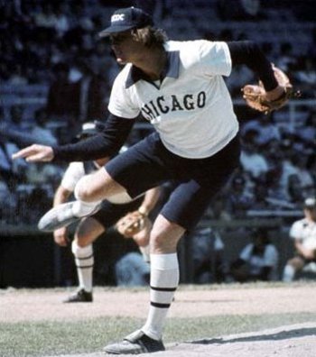
An eagle-eyed user caught this: the M-Den is now listing something hardly different from the doomiform the Free Press published and Dave Brandon laughed at:

That looks official what with its number and the Adidas logo and looking all like a thing that exists in the world. You still can't buy one (it errors out when you click on the monstrosity) but I think it's official enough to say that Michigan is going to look very, very stupid when they take the field against Notre Dame.
(new scoreboards new scoreboards new scoreboards not a cesspool of filth and corruption so deep Sepp Blatter is impressed deep breaths)
I hope the players are prepared to grow the handlebar moustaches that should be worn with these jerseys.
Must be a fake.
At first my reaction was "MY BRAIN IS MELTING OUT MY EAR!" The more I look at it, though, the more it's starting to grow on me.
If maize jerseys don't happen this year, I don't think they'll EVER happen. I had my hopes up.
:'(
Are we playing Football or Futbol?
If there were a time for the flailing arm smiley face this would be it.
I mean, remove the strikes and it would be half decent. The striping looks terrible.
There is some cool historical things
1.) All national Championship years across the bottom of the jersey.
2.) I can't completely tell but appears "Those who stay will be Champions" is on the neckline... Or something to that affect.
So the sleeves still look terrible but with "athletic" cut with shorter sleeves it will look ok on the field. I'm just saying it could be worse.
All it needs is a maize Halo.
Realize that 60% of that sleeve wont be visible on the players. They wont be playing with replica jerseys that have sleeves down to their elbows. They'll almost all be playing with high and tight sleeves.
Basically cut them at the top of the block M. That's what we'll see when they take the field. A lot less Mazie Zebra Arms.
Plus in shoulder pads they may not look so God Aweful.
I'm holding out hope that they look better when worn in pads with pants and helmets.
This explanation makes it better for me as I was just thinking that if they limit the striping to the shoulders that it would be ok...not great, but ok. And certainly not as bad as the replicas with the full sleeve will look.
I'm hoping you're right. I'm also hoping that at the official announcement they have a player modeling the entire look. Of course, they might also do something stupid with the pants or helmet.
That's true. Once the sleeves get cut and/or taped up under the shoulderpads, the jersey won't look so bad.
I think they'll still be ugly, but not quite as ugly as they could be.
I know that being on the MDen site and tagged as "Michigan Night Game" on the mouse-over makes this seem very legit, it still doesn't address the NCAA rule that player numbers must be at least 8" in size on the front and back of the jerseys. Am I remembering this rule correctly? There's no way that front number is 8 inches.
Granting one-game waivers of that rule are not uncommon, particularly if (as here) there appears to be substantial compliance.
Yes, the NCAA Rule is that the front must have numbers at least 8 inches high in front and 10 inches high in back, and that the "bars" of the numbers must be 1.5 inches thick (Rule 1-4-4-f).
From the rulebook: "If a player is not wearing mandatory equipment in compliance in all respects with Rule 1-4-4, the team shall be charged a timeout and the player shall not be permitted to play until he complies." So presumably if Michigan comes out dressed in these getups, the entire team will be ineligible until they change back into their real uniforms.
Also, there are 2 other things illegal about this uniform:
(1) Rule 1-4-5-l prohibits "Anything on the uniform other than a player’s numbers; a player’s name; NCAA Football logo; memorial recognition; the American flag; or institution, conference or game identification. No other words, numbers or symbols are permitted on a player’s person or tape (Exception: Game information on a player’s wrist or arm)." So the numbers around the waist are not permitted.
(2) Also, Rule 1-4-5-l states that "Uniforms and all other items of apparel may bear only a single manufacturer’s or distributor’s normal label or trademark (regardless of the visibility of the label or trademark) not to exceed 2-1/4 square inches in area (i.e., rectangle, square, parallelogram) including any additional material (e.g., patch) surrounding the normal trademark or logo." So 1 of the 2 Adidas logos on the shirt would have to be removed. The one at the waist looks much bigger than 2.25 square inches.
Note also that a waiver of this rule is not permitted. Page FR-16 of the rule book lists rules that may be altered by mutual agreement, and neither 1-4-4 nor 1-4-5 are mentioned. "
That will eliminate the issue with the numbers around the waist and that adidas logo is on most replica jerseys, whether or not they're on the game jersey. Unless you're saying that these jerseys are also illegal:

However, the M on the front is probably an issue that would need NCAA permission. Also, I'm just curious has the rule for waivers you referenced been updated to include the new waiver available for teams wearing contrasting dark jerseys? The one that would deal with the USC/UCLA situation?
Of course the jerseys will be tucked in--there's a rule (Rule 1-4-5-e) requiring that, too. Actually, I suspect that the example you show (and the example in Brian's post) do not match the game-worn versions exactly. I think the manufacturers logo and the "XL" label do not appear on the actual game-worn versions.
There is a specific allowance in the rules for the USC/UCLA situation where a waiver of that section is now permitted:
Rule 1-4-3 "If the home team wears colored jerseys, the visiting team may also wear colored jerseys, if and only if the following conditions have been satisfied: (a) The home team has agreed in writing prior to the game; and (b) The conference of the home team certifies that the jersey of the visiting team is of a contrasting color."
I actually don't hate it, but you have to picture it at night, and only at night. Any other setting would suck epically, but I think this could actually be ok.
It doesn't look too bad if you look at it like this:

With the stripes, they look like something a prisoner would wear. This would be a better type of design for Ohio State, since they will soon be in NCAA jail.
Weird to have a throwback jersey that ain't much like anything Michigan has ever worn. On the other hand they're not so different from the Otago (New Zealand) rugby jersey circa 1999-2000:
If you follow the MDen link, the image of the jersey no longer appears.
How about a throw back uniform from 1969? Numbers front, back, and sleeve. No names. No little block M. No bright yellow. No Addidas logo.

Time to "throwback" these jerseys to the soccer team.
I'd rather see them come out in the low-talker puffy shirts from Seinfeld.
Pure corporate geekdom. Throwback by task force.
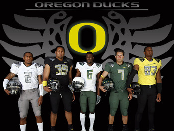
If Brandon really wants to alter the unis -- and I have no problem with that if done right -- just go back to Nike and do mix and match maize, blue, and white like Oregon's from the mid-aughts, before they went haywire. That would be eleventy billion times better an idea than this nonsense.
I haven't read all the responses here yet but can someone explain why the block M has cracks in it? The shade of blue is too light and I hate the stripes. What's the obsession with the stripes?
I still don't understand why the team couldn't wear their current uniforms but whatever. It's out of my control so I'm going to have to just get over it.
It's (presumably faux) stitching, a la what you see on hockey jerseys, to adhere the M to the jersey itself. Although it's usually the same color as the tackle twill itself...
I think they should have a presser to show off the throwback jerseys and have them EXACTLY the same as the current jerseys.
i hope people realize that those angular lines in the block M and numbers are just stitching and not really a design element. i know WTKA described it as "stained glass" and just made it sound like something totally different from that it is.
that being said, they look like soccer jerseys. i also thought the big chill jerseys were fairly ugly but then their ugliness grew on me and then they grew on me more after the players in those jerseys stomped all over msu.
Those may be the fugliest uniforms in college football history. We are going to make Oregon look good.
i do not like the hand that he twirls a gold coin with and says "you will buy this. you will buy this. you will buy this."
i will leave judgement until game time. i remember thinking how hideous the big chill hockey jerseys looked when they came out and maybe i am still alone, but i thought for the game they actually looked pretty cool.
are worn. People would blame him for it, along with the stuff he did have responsibility for.
Having said that... "This is Michigan, for God's sake." Where does Brady Hoke stand on this?
...but you can glean some information on his fashion sense here:
http://mgoblog.com/mgoboard/brady-hoke-michigan-man-where%E2%80%99s-baseball-cap
Brandon should have given Michigan fans/students or alumni a choice and let them decide what throwbacks are best.
A better idea would have been to use same Maize pants, same blue jerseys, but a slightly modified helmet - same Michigan classic wings and stripes, but some special artwork painted to make it look 3-D like a leather helmet with the stitching, etc..
Another opportunity missed to be unique and cool and otherwise not look awful.
Like the Notre Stain lucky charms helmets though.
I love them...and I dont see the big deal for those that dont....it is a one game thing and thats it....those uni tops look sort of classic and will still be Michigan when the helmet and pants are donned with them... very nice
I guess for me, it just looks like one of those off-brand faux jerseys you find at big box stores. Adidas had a chance to really nail this, to put something together that actually at least attempts to approximate a historical uniform, and they didn't do it. Instead we're going to get a few paragraphs in a press release trying to justify individual elements of the jersey under some header of "recognizing the rich tradition of Michigan Football..."
I mean, the OSU Pro Combat's were pretty iffy, but at least they at least more than somewhat resembled actual historic Buckeye uniforms. These, not so much.
Let me guess: from the people who brought you:

...or maybe:

Why do you hate Grant Hill?
<br>
<br>Oh, nevermind. The Fab 5 told us why.
<br>
<br>
<br>/s
Throwback? more like throw-up...maybe it will hypnotise ND and they wont able to stop staring at them. home jersey advantage?
Not as bad as most of you are making it seem.
Can we go back to Nike? or better yet Under Armour!
Nike: The bastion of taste and tradition:
Please. God. No.
Here's a simple modification I think could make it less crazy. It would at least leave some (blue) space around the helmet so it doesn't compete directly with the stripes. Just a thought.

that looks worse, IMO - more like Waldo.
Don't know about the vest look.
fashioned, tho I'll be damned if I could say why.
Comments