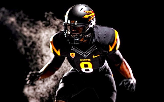
OT: Arizona St's new Nike unis

And here's the Dr Saturday write-up about them. And even more examples, including non-football sports.
They are pretty bad-ass, actually. But they might look less cool without the wispy smoke.
Those are pretty badass. The helmet logo is a bit... gimmicky, though.
As long as it's not my team (the wolverines).
<br>
<br>
April 12th, 2011 at 11:49 PM ^
are pretty terrible in my opinion. They were in serious need of a change about 20 years ago or more.
April 13th, 2011 at 12:09 AM ^
Gimmicky: yes. XFL-level gimmicky: not quite. But give them time.
That is all
All black uniforms usually look badass, and this is no exception.
that they didn't show what the new wrestling singlet will look like. ASU did just crown two champs a few weeks ago. as for the football uni's i like them. not too much going on and you can't dig too much on a uni that has "PT42" on it.
...I'm just not excited by a redesign that completely excludes the longstanding logo.
I agree. The student body isn't that pleased with it either. They were taking about eliminating the mascot completely but that was shot down within the last few days.
How could anyone get rid of Sparky?

April 12th, 2011 at 11:16 PM ^
They could've done a logo where Sparky tattooed the mustache on his finger.
1) Why do they have a trident on the helmet?
2) Why would a team that plays in a perpetually hot and sunny desert wear all black?
1) it's a pitchfork. The item Sparky is always holding.
2) It's an alternate. ASU usually plays at night anyway.
Arizona St>Sun Devil>Trident... that wasn't that hard
I thought the Devil had a pitchfork. After further google review, it's not clear cut.
The thing the devil is usually portrayed as holding is a trident, i.e. a three-pronged spear. In the vernacular, we usually call the devil's weapon a "pitchfork", which is really a farm implement for tossing hay, but w/e. "Fear the Fork" makes for a better slogan than "Fear the Dent".
Trident-

Pitch fork-

Good work. It's posts like yours that separate MGoBlog from cesspools like MLive.
But thanks. ;-)
I mean, if I was really being scholarly, I should have gone into "tri" meaning 3, and the 3 prongs, etc., etc.....but that's not nearly as much fun as toy weapon pics.
"2) Why would a team that plays in a perpetually hot and sunny desert wear all black?"
They play almost all of their home games at night anyways.
April 13th, 2011 at 12:39 PM ^
Brick, I’ve been meaning to talk to you about that. You should find yourself a safehouse or a relative close by. Lay low for a while, because you’re probably wanted for murder.
They dropped the Sparky logo and added the pitchfork. Not so sure I agree with it. Also, the "ASU" located on the side of the sleeve is just cheesy. If you must remind someone of who you are, you're not doing things right. They also added white pants which is a big upgrade. The maroon pants needed to go.
I may be in the minority, but I like Nike's uniforms (for the most part). I bet if I wore one, I could almost pick up some chicks.
Or HOT chicks?
Anyway, count me as a fan of Sparky. As a child I liked those uniforms, and I used to wear an ASU baseball hat around in high school (God knows why, I guess I just liked that too).
April 12th, 2011 at 10:24 PM ^
April 12th, 2011 at 10:33 PM ^
This girl likes Nike uniforms almost as much as she likes playing offensive guard.

April 12th, 2011 at 10:36 PM ^
Good Lord, Justin Boren needs to get a haircut.
back in 1995. This looks like something out of the movie Any Given Sunday. I hate when team's get away from their traditional unis
It is not like there is a lot of tradition behind a Sun Devil helmet to begin with. If this were Penn.St, ND, or us it would be a F'ing travesty. They are in the Pac12 and on at 10:00 at night, any publicity is good publicity.
April 12th, 2011 at 11:11 PM ^
was that they were butt-ugly.
No one is gonna miss the maroon & yellow or the green & yellow.
Ya had to be a loyal fan to buy something in those colors.
I actually like the new unis a lot, except for the following
1) Weird rays/flames from the trident (which they call a pitchfork but w/e) - is it a pitchfork, or a rocket ship?
2) Gradient on the black uni numbers. Guh.
3) The black unis in general. They look kind of cool, but I'm sick of black for black's sake. It's been done, get over it. The maroon unis look great.
I'm okay with ditching Sparky from the helmet, it was a bit cartoonish and frankly didn't stand out on the field. The new fork has more pop and looks less outdated ("traditional" is good, "outdated" is bad).
I live in Phoenix and the ASU alums at work are generally pleased, though many agree with my dislike of the black unis.
Black for Black's Sake? Fellow Uni-Watch reader I take it?
Really, I think this was a downgrade. They had a recognizable look, now they will look like part of the Nike herd.
April 12th, 2011 at 11:21 PM ^
Actually not a reader of Uni-Watch. But I did come across the acronym BFBS on another blog.
I fully agree with the sentiment that BFBS is BS.
Am I a ghost poster? I don't think anyone has responded to me in months. Please let me know if you can see this. A buddy said I'm non existent on this thread.
But not the webpage.
You get banned or something, in a previous life?
Edit: not responding to Gbdub, but ChuckWood-
April 13th, 2011 at 12:19 AM ^
I'm not sure. I was never notified of anything. And nothing changed with my account. I've been talking to myself for a few months now. What do you suggest I do? Since you know, you see dead people and all.
I promise I'm a contributor and far from a troll.
You know, like Harvey the bunny.
<br>
<br>But if that doesn't excite you, email Brian. Don't complain, just explain the confusing situation. Might just be a really odd, individual glitch with the site meltdown.
Thank you, I'll do that. And I may be invisible but far from imaginary. I felt like Bruce Willis earlier when I found out I've been dead for several months.
If I was banned for some odd reason would I have been notified? Or would have my account changed? Sorry I'm asking so many questions, you're really the only person that's responded forever.
Anyone on the App can, I'm sure. But the deleted posts still show there too.
<br>
<br>I wouldn't think you've been banned without an email; and without GOOD reason, that you'd remember. They lean heavily toward free speech, and let one hang themselves pretty much. That's why I said don't act mad, because it probably wasn't action against you, but a glitch. Think they stopped showing up right around the Malware disaster time? Not being that technical, that would be my uneducated bet.
April 12th, 2011 at 10:23 PM ^
I see dead people.

I agree. I think they do a pretty good job. There are a few exceptions, but for the most part they are pretty decent looking. For this particular example, I actually like the maroon and white ones more than the black.
The devil/pitchfork logo was one of the more venerable and classic illustrational marks, and was truly original and distinctive. They've thrown that all overboard in favor of an already-dated flavor-of-the-month that is more at home in the Arena League.
It makes me wonder again: if there is a single athletic director in the country with the brains and the balls to tell Phil Knight—and his money—to go fuck himself?
Nike uniforms are almost always Arena League uniforms
I think the old logo looked kinda outdated and cheesy, but it definitely was unique. I like the new uni's other than a lack of any kind of logo whatsoever. They should have updated the old one instead of scrapping it altogether.
I like the trident logo on the helmet, although I would have put a sunburst behind it. I think Sparky had a little too much fine detail for a helmet. It looked ok up close, but in a typical line-of-scrimmage shot it was hard to make out the details.
Now the all-black uniform would be fine for Missouri or Southern Miss but it just looks stupid on ASU. Black is not one of their colors. Their colors are maroon and gold.
April 12th, 2011 at 11:11 PM ^
This. Sparky makes for a decent mascot, but there's too much detail for a helmet. The new pitchfork motif will show up better. If you look at the link to ASUs facebook page, it looks like a smaller Sparky will still be on the back of the helmet, next to the Pac 12 logo.
April 12th, 2011 at 10:10 PM ^
I'll concede that they aren't bad, but most of Nike's redesigns (Pro Combats, Michigan State's logo debacle, giving Baylor of all people the second Oregon treatment, and Oregon's earlier uniforms themselves) are terrible. Good to see that they're improving.