OT: Detroit Tigers City Connect Jersey

The Tigers unveiled their City Connect, what are everyone's thoughts? Me I don't think they are the worst, but the Old English D is very iconic...
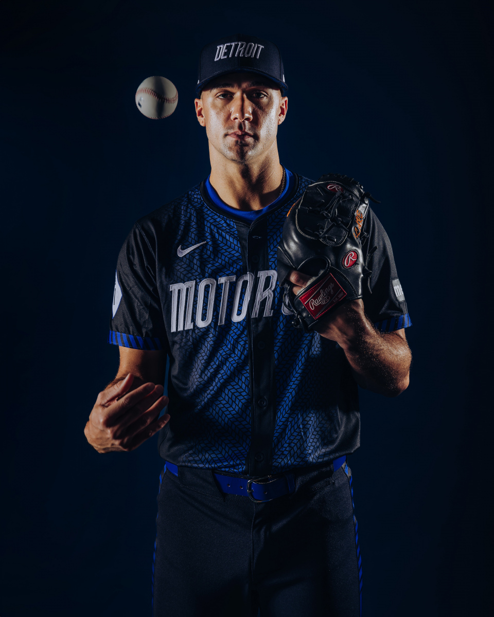
“The City Connect uniforms represent Detroit’s unique combination of muscle and innovation and pay homage to the city that put the world on wheels,” Ilitch Sports + Entertainment president/CEO Ryan Gustafson said in a release. “From the tire treads to the VIN tag to the M-1 patch on the sleeve, there are unique features on the uniforms, caps and batting helmets we feel Tigers fans and Detroiters will appreciate. Above all, the uniforms are symbolic of the revitalization and exciting future ahead for the Tigers and our great city.”
https://www.mlb.com/tigers/news/tigers-unveil-city-connect-uniform
These look like they're for the baseball equivalent of an Arena Football League team. I wish MLB would stop designing 'alternate' jerseys and just stick to the classic ones. The old English D is iconic.
I wish they would too, but they wont. Right now, the hottest league, in terms of trends and style, is the NBA.
And the NBA is basically requiring teams to have at least 4 jersey styles a year, and many more in certain cases, once you factory in things like spanish and chinese language variants.
I'm a traditionalist too, but these city connect jerseys are not meant to be recognizable, they're meant to look as different as possible and sell merch. Nike isn't paying hundreds of millions of dollars to try to sell you the same jersey you've had in your closet for 30 years.
I didn’t think I’d say this, but I miss David Stern. He understood that there was value in brand identity and only let teams have one alternate uniform. He also refused to budge on jersey ads.
Adam Silver just seems to look to make a quick buck wherever possible. It’s OK to tell Nike “No” sometimes.
And they aren't even our colors. These look like MLB players supporting the Lions.
At least throw some orange in there or something.
Good point and not having any orange trim is missing. It would be a nice flair to have orange trim on the end of the sleeves on the jersey, for example. I am not impressed with this alternate uni release.
BTW, will Chicago have a Windy City uni?
https://www.mlbshop.com/chicago-cubs/city-connect/t-36222022+c-5658996363+z-91-4259257501
Cubs have Wrigleyville. Nobody cares about the White Sox. Not even Frank Gallagher.
I actually like it but agree that they should have found a spot for the Old English "D"
I’m sorry, but that is not a Major League Baseball uniform.
I’ve come to expect this nonsense from the NBA but thought MLB had a little more fashion sense.
The league directors from local softball team design the City Connect jerseys.
These City Connect uniforms demean us all.
I'm a traditionalist and I wish the Olde English D were more prominent. And all the City Connect jerseys are a money grab. But, I like the look of the jersey and might just buy one. Not as a baseball shirt but as an interesting hat tip to the 313.
Most city connect shirts are ridiculous. Like yellow for the Red Sox. Or whatever the hell Texas was trying to accomplish. But there are a few cool ones. The White Sox Southside uniforms and the Cinci black and red.
As a long-time Red Sox fan, I knew that the Red Sox City Connect uniforms, caps and socks released in 2021 in yellow and sky blue were meant as a tribute to the Boston Marathon colors. LINK

My first reaction when I saw those uniforms was that they looked like UCLA baseball uniforms.

Upvoting just because you know what UCLA's baseball uni looks like.
That's impressive to me and a sign of a true fan of the game.
The Braves City Connect jersey isn't anything earth-shattering, but I love it b/c it's basically a 1970s throwback uni and it looks great.
I'll be honest - that they do not involve the iconic English "D" is quite distracting for me, to the point of being the source of some disappointment.
Just one more revenue stream. Sell merch.
I’m generally not a fan of the non-team colors of these City Connect jerseys. I prefer they use the throw-back team colors with an image of what the city is know for. But hey, the kids like them.
Looks like a damned bowling shirt. Awful. Leave the old English D on the home jersey where it's been for 130 years. Use those nasty jerseys on the road, let another city connect
I'd rather buy scarlet and gray than this stupid jersey. And I freakin hate scarlet and gray
I agree until your second paragraph.
NEVER scarlet and gray anything.
The City Connect uniforms look like something the Pistons would wear.
The Old English D cannot be improved upon. I am Ok with the alt jersey to celebrate Negro League Baseball and the uniform for Hispanic Heritage Nights but that's it.
For road jerseys I like the road greys they wore in the 68 World Series before the orange was added.
"pay homage to the city that put the world on wheels"
Don't see any mention of Cannstatt, or 13th century England if we really want to go pre motor
Nike's ruined MLB & NBA jerseys. The quality is worse, the designs are unimaginative, and they try too hard to push out way too new deigns each year just to sell more. I was excited when they took over for those leagues and Michigan but it's been a let down. The fan gear is meh. And now because Nike sold exclusivity of making NFL & CFB fan apparel to Fanatics, the MDen lost their license to even sell stitched jerseys with player names/numbers. This is why you see players' families at games all rocking knock off jerseys from DHGate/AliExpress. It should be embarrassing for U-M & Nike but that's Nike MO, reduce quality & increase price because people will buy continue to buy anything with a swoosh or jumpman on it.
The video/commercial is pretty cool, the uniforms not so much. I agree w/ the others, they should have at least kept the old english D on the cap.
These are awful. The idea of putting a tire track down the middle to symbolize being run over is really bad. It reminds me of our awful tire track basketball uniforms. (Let's never mention those again.)
The hat is too generic and the 3s in the 313 patch are illegible, making a cool idea bad through awful execution.
No orange on the unis? They are the "tigers," after all.
These look like the jerseys of the travel team my son played against yesterday. Awful.
If they want a new jersey. Go back to the iconic road jerseys the Tigers had in the 1980's and make that their permanent road jersey.
pretty terrible. not even the Tigers shade of blue. It might have been salvaged if the D was on the hat. leave this in spring ball
This looks like what you'd see in a movie set in a fictional future where the Olde English D uniform never existed. I'm not a fan.
If you want to connect with the city, maybe use something iconic from that city. For example, and of these would do.
[Insert image here]
EDIT: For the life of me, I cannot get an image to render correctly on this stinking blog anymore. I give up.
Don't drag and drop images; upload them using the "Insert Images" icon. 

I think it is fine for a one off. I just hate the alternative money grab on one of the best home uniforms in any sport ever.
Motor Shitty. These are an abomination.
This is the blue 1906 Road Jersey. I like it far more than these City Connect Jerseys, but its not really that big of deal if they only wear it one game. If they ever permanently changed the road jersey, I would prefer it played on this version shown below:

Little league. And I was born in the D. Not the burbs, either. Henry Ford Hospital. I get an extra vote. :)
As a Pirates fan, I don't hate the Pittsburgh city connect uniforms. Other than the PGH, they look like they could be worn by a professional team; unlike Detroit who looks like they'll be wearing a AA team's uniform when competing against the Bananas.
It's garbage.
"MLB needs to appeal to younger people."
"No, not like that!"
I have no problem with them.
Absolutely hate the DETROIT logo on the caps . That's a definite non-starter for me, even though I think the VIN is pretty cool.
Also inexcusable that the English D and the color orange aren't featured.
And tire tracks? Are they the Akron Tigers?
It really is sad how much greed and capitalism have cheapened pro sports. The uniforms from league to league have been cheapened as everyone needs multiple. I miss the days of home and away where the actual uniforms were professional and made of quality material. The whole enterprise feels like a nonstop sales pitch at this point. The sacred exists materially except that we’ve decided that it doesn’t culturally.
Short version: Fuck these clowniforms and get off my lawn!
Capitalism is the solution, not the problem. If people refuse to buy the uniform, MLB loses money. They don't want to lose money. That is capitalism.
Capitalism clearly wasn't the solution to THIS problem. Because those uniforms are ass.
moar neon
Only 33 so I may be a little early to the get off mg lawn crowd but I’ve hated alternate uniforms basically since the beginning. The lone exception being in baseball an alternate top at home to go with white pants and even then, some teams shouldn’t ever change home and away. I include the tigers in that.
I miss the days of sponsors not being on all uniforms and 40 uniform combinations. Newer teams will never have an iconic/classic look and that is sad.
The secret strategy by MLB is to spur traditionalists to defend their preferences by buying classic-style gear.
Since they hit like a slo-pitch softball team, they might as well dress like one.
How about getting some bats in the line up first before we worry about NBA style jerseys?
So glad my Yankees don't do city connect uniforms. They are trash
I don’t get the city connect uniforms. Looked at a bunch of them online, and with a couple exceptions, they all ranged from lame to awful. These I would rate as lame.
Mr I would have never approved these.
These suck and I am not old man yelling at clouds guy - I love the alternative Detroit Lions uni and helmet! These are like Michigan's bumble bees. Pathetic.
Maybe go with the orange if nothing else.