Maize and Blue Sesquicentennial

Happy 150th Birthday, Maize & Blue!
Sunday, February 12, marks 150 years of Maize and Blue being the school colors of the University of Michigan. I’m guessing that this will get some press elsewhere, but I thought the story would be of interest to fans and alums, so here it is:
Adoption of Azure Blue and Maize as School Colors:
On February 12, 1867, a committee of the “literary department” gathered in the College Chapel for some important business – the adoption of school colors for The University of Michigan. Established in 1817, the school had for fifty years made no declaration of the school colors.
Our college colors were chosen at a meeting of the literary department held in the chapel on Saturday, February 12, 1867, when Milton Jackson, ’67, Albert H. Pattengill, ’68, and J. Eugene Jackson, ’69, the committee appointed for the purpose, reported a resolution in favor of “azure-blue and maize”, which was adopted. In about ten years the colors came to be styled, as they are now styled, yellow and blue. The original blue was neither light nor very dark, and the yellow was decidedly golden. Never has there been any warrant for the sickly yellow and the faded blue furnished by some of the tradesmen of Detroit and Ann Arbor.
Mvictors quoting The Michigan Book, pub. 1898 LINK
The official word came via resolution:
Your committee, appointed to select emblematic colors for our University, unanimously agree in presenting as their choice, Azure Blue and Maize, and recommend that the following resolution be adopted: 'Resolved, that Azure Blue and Maize be adopted as the emblematic colors of the University of Michigan
Liene Karels (Fall 1996). "Which Maize and Blue?". Michigan Today(courtesy of Wikipedia).
Of note, committee member Albert Pattengill went on to be both a professor of classical and romance languages at Michigan, and to chair the athletic board (precursor to the athletic department) until he died in 1906. History of the University of Michigan, Burke Aaron Hinsdale, page 263, Courtesy of Wikipedia. Maize and Blue have been integral in both academics and athletics from the time of their adoption.
OK, So What Are “Azure Blue” and “Maize”?:
The business of trying to pin down exactly what “Azure Blue and Maize” are, though, took another 45 years. The inspiration from 1867 is generally agreed to be the color of a clear blue sky (which narrows it down to approximately one hundred thousand possible colors, IMO) and “Indian corn” (which is far more specific IMO, but not – apparently – in the pre-Harbaugh athletic department of recent years). So what exactly are “Azure Blue” and “Maize”? The question remained unsettled until 1912. (And color scientists can reasonably argue that it remains unsettled to this day – although the Pantone colors used by the Office of Communication are pretty well-defined.)
In 1912, disheartened by the pastel-ization of maize and blue in official uses, a committee prepared a report for the Regents to achieve an official designation of the particular school colors, underscoring that it would not stand to have our athletic teams wearing baby blue and nursery-room yellow (that’s what 1990s UCLA would be for). History of the University of Michigan, Burke Aaron Hinsdale, page 263, Courtesy of Wikipedia.
The committee report is well worth a read, and can be found HERE. The report concluded:
There appears to be no record that the exact shades of the colors of the University were ever determined. The color blue was made use of officially by the University before the class of 1867 chose the "maize and azure blue" as emblematic of the University. LINK
The report continues on to observe:
In short, the blue color, which is the one longest associated with the University, starting with a shade almost as dark as "navy blue" has gradually weakened until it has the tint known as "baby blue." The maize, likewise, has faded to correspond, and is now an expressionless pale yellow. So delicate have the colors become, that they have not only lost their original character, but are ineffective in decorations, and useless to the Athletic association, which has been forced to employ colors entirely different from those which recent graduates regard the University colors. It is only necessary to see the diversity of the banners which are displayed in the store windows to realize the confusion which exists.
Then, to clarify, the committee references other undefined colors:
Azure blue, as defined by the dictionaries, is lapis lazuli, Prussian blue, cobalt blue, ultramarine blue, the clear blue color of the unclouded sky. Maize is the color of the Indian corn.
Bentley has an example that I believe is circa 1912, although it may have faded over the years:

1912 Style
Current Style (http://vpcomm.umich.edu/brand/style-guide/design-principles/colors ):
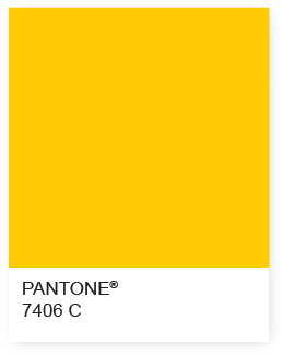
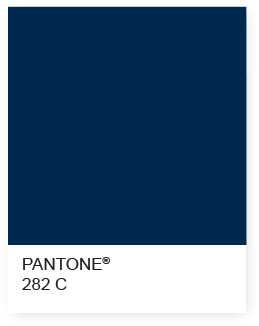
Do the current colors hit the mark? We’ve seen this debated on this site before, but I submit that they are pretty close (and great looking). I might want a little more saturation in the maize, and perhaps a smidge darker, but I’m happy with what they came up with.
So Happy Birthday, Maize and Blue! For 150 years we’ve enjoyed the best color combination of any university, anywhere. Well done, Messrs. Jackson, Pattengill and Jackson!!
[Note - Any time someone writes on this site about the school colors, I’m impressed by the collective knowledge on the topic and the passionate views as to what the school’s official colors should be. So if anyone has corrections, etc., please put them in the comments. I’ve provided citations and hyperlinks at points above for the curious.]
February 11th, 2017 at 11:49 AM ^
It looks like you're linking from your c: drive instead of a url.
February 11th, 2017 at 11:54 AM ^
Hopefully this is working now!
February 11th, 2017 at 12:08 PM ^
I also like a good maize and blue color discussion.
Very informative, thanks for posting!
February 11th, 2017 at 12:45 PM ^
February 11th, 2017 at 7:28 PM ^
February 11th, 2017 at 12:08 PM ^
February 11th, 2017 at 2:38 PM ^
Thanks for sharing.
February 11th, 2017 at 2:48 PM ^
Very informative
February 11th, 2017 at 4:10 PM ^
February 11th, 2017 at 5:40 PM ^

The picture on the front of my shirt was different but the dark maize color of the shirt was exactly the same.
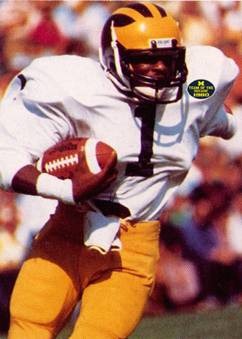
Here's AC from the 1980 season heading into the 81 rose bowl:
http://mvictors.com/dr-sap-discusses-the-bo-brackets-wtka-audio-4-18/
I know lighting and angles make a huge difference in how light or dark the maize appears but for sentimental reasons from my youth I've always preferred a darker shade of maize.
The highlighter years were an abomination to these old eyes.
February 11th, 2017 at 4:39 PM ^
February 11th, 2017 at 6:00 PM ^
I believe these were called "bleed out", probably because they made blood come out of everyone's eyes.

http://www.mlive.com/wolverines/index.ssf/2013/03/michigan_to_wear_maiz…

February 11th, 2017 at 7:48 PM ^
I've always preferred the paler cornsilk yellow for "maize" and a very dark blue (but not so blue it looks black). I know the bilious orangy shade is the more "historically correct" shade of maize, but it is, unfortunately, ugly, and doesn't set off well against dark blue. Highlighter yellow is even worse, both by itself and in comination with blue. I' think the maize by the football team now looks good, but think it would look better if paler.
I'm surprised to see a thread about maize and blue that hasn't trotted out the old canard about "Nike patented the color maize." Maybe that one is finally dead?
February 11th, 2017 at 9:38 PM ^
they left the official Pantone's out of that original resolution. What were they thinking?
February 12th, 2017 at 12:09 PM ^
February 12th, 2017 at 12:09 PM ^
February 12th, 2017 at 12:10 PM ^
February 12th, 2017 at 1:54 PM ^
February 13th, 2017 at 7:51 AM ^
February 13th, 2017 at 3:16 PM ^
You nailed it, pity indeed. Blue-Yellow Color blindness is rare....but whats worse, you think blue is green...I'd definelty head to Boliva or Putingrad for treatment.
February 12th, 2017 at 10:45 PM ^
And +1 for maize and blue in any shade it shows up on the field or court.
Comments